

PMI
Case Study: Career Navigator, Beta to Launch
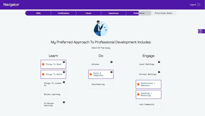
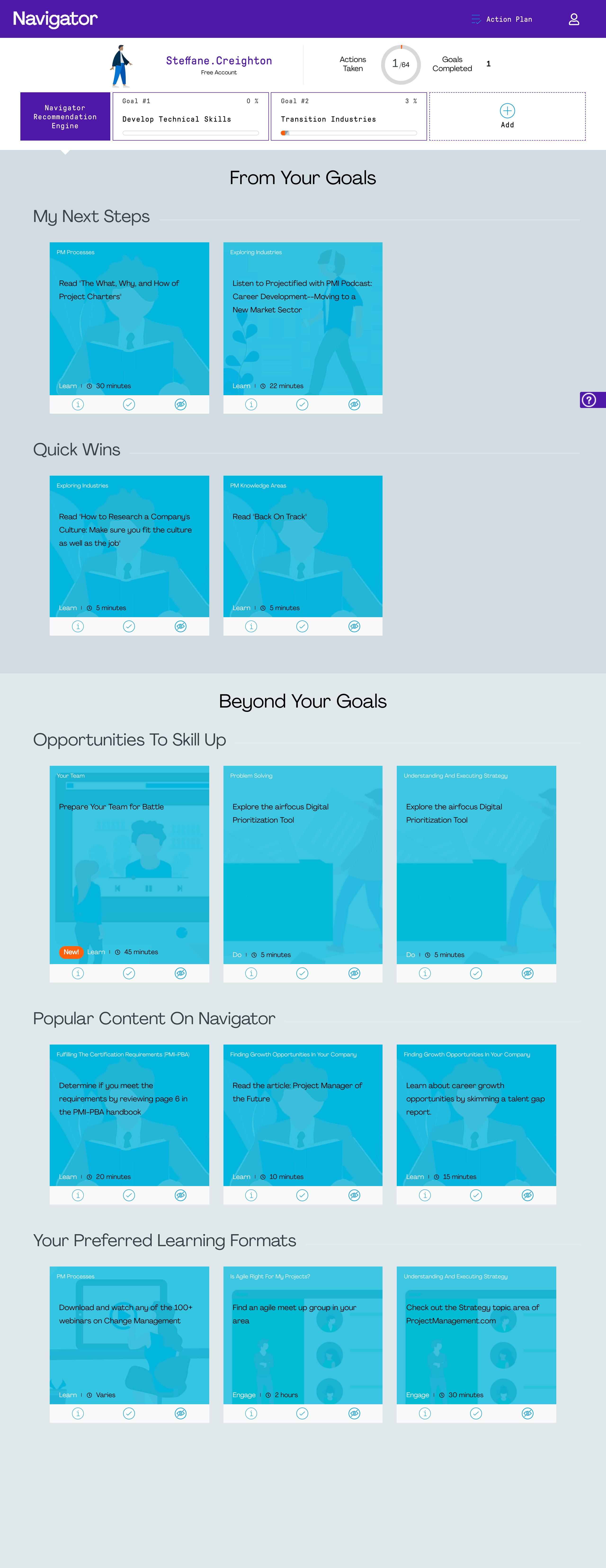
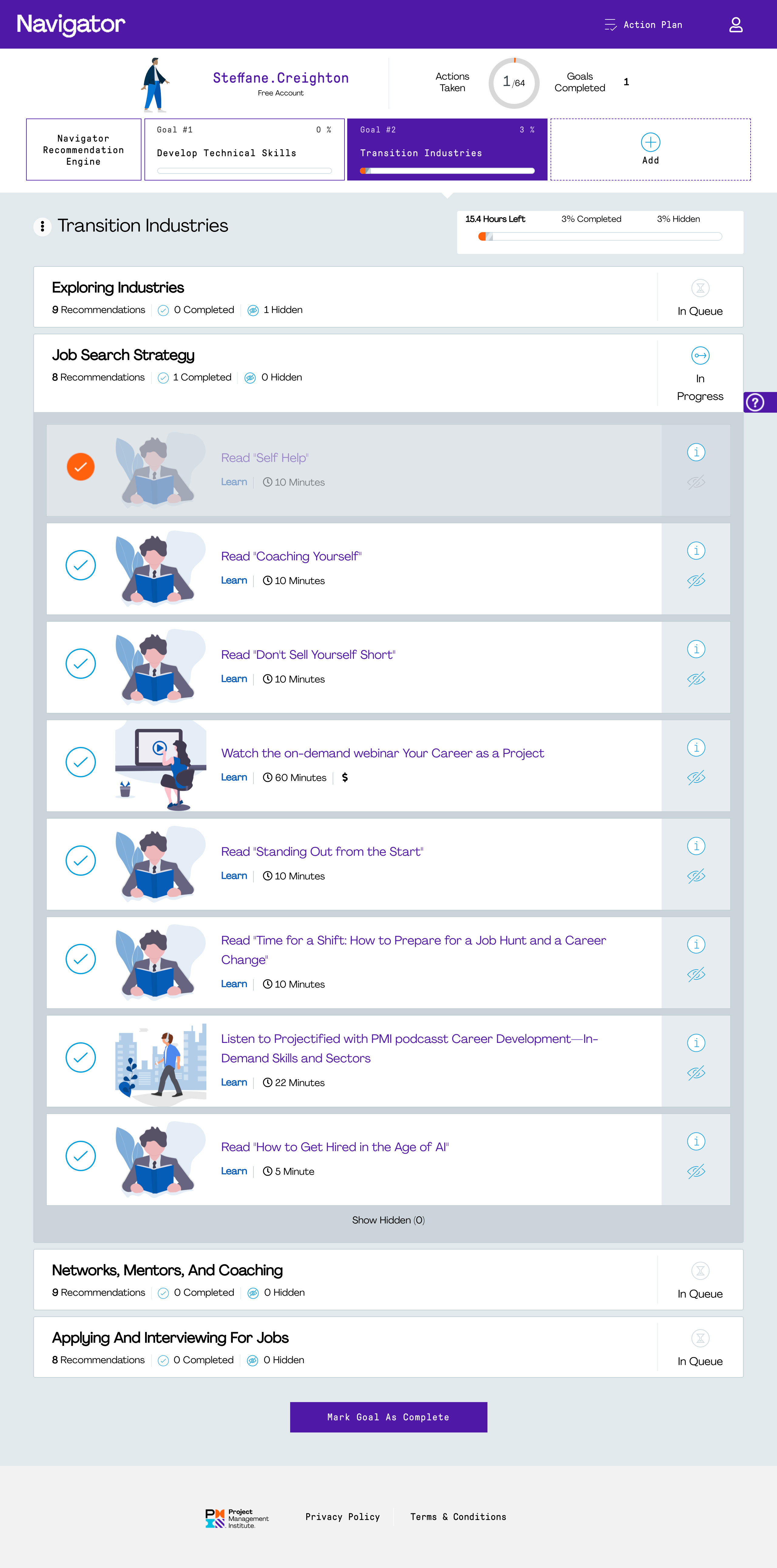
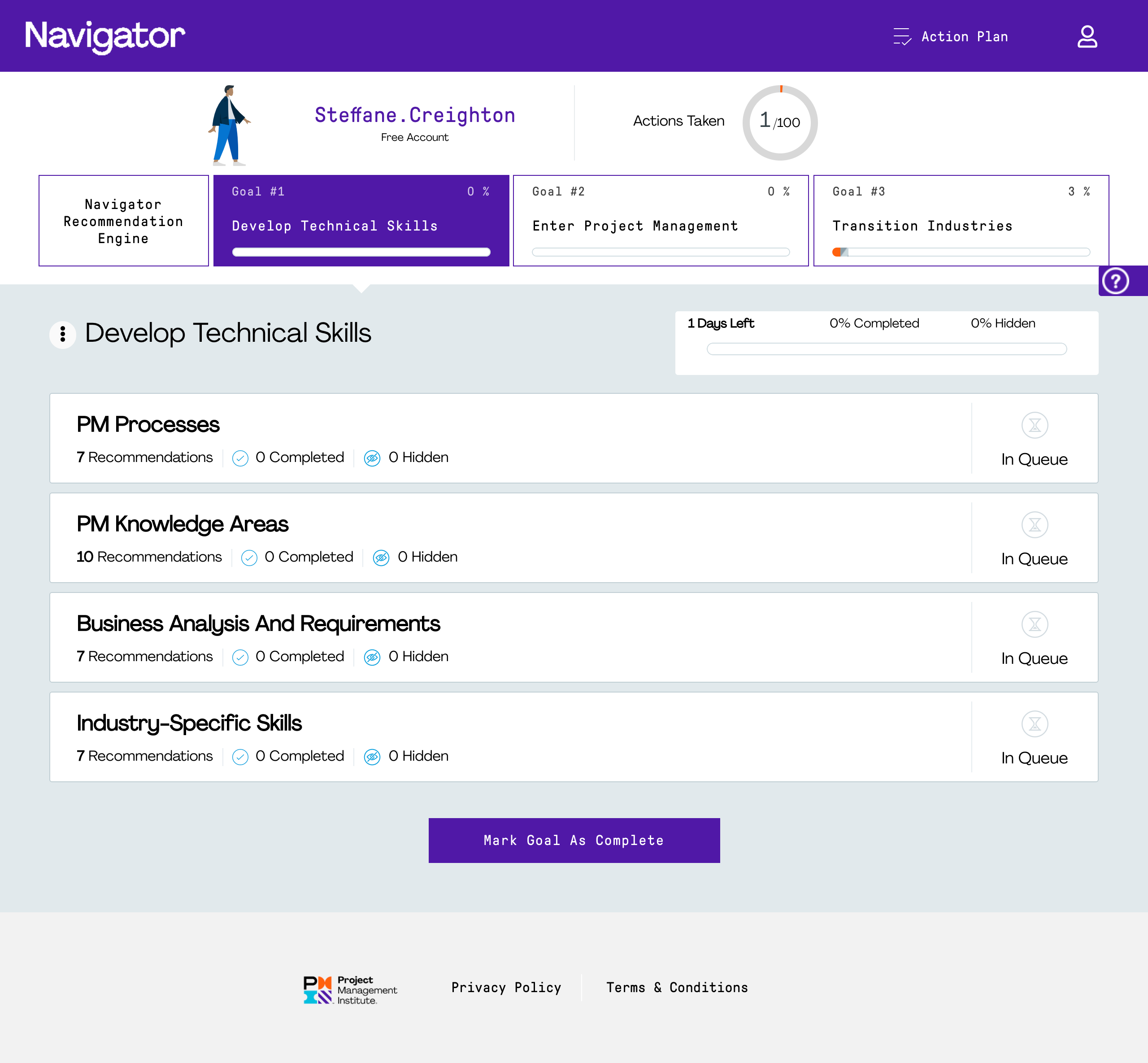
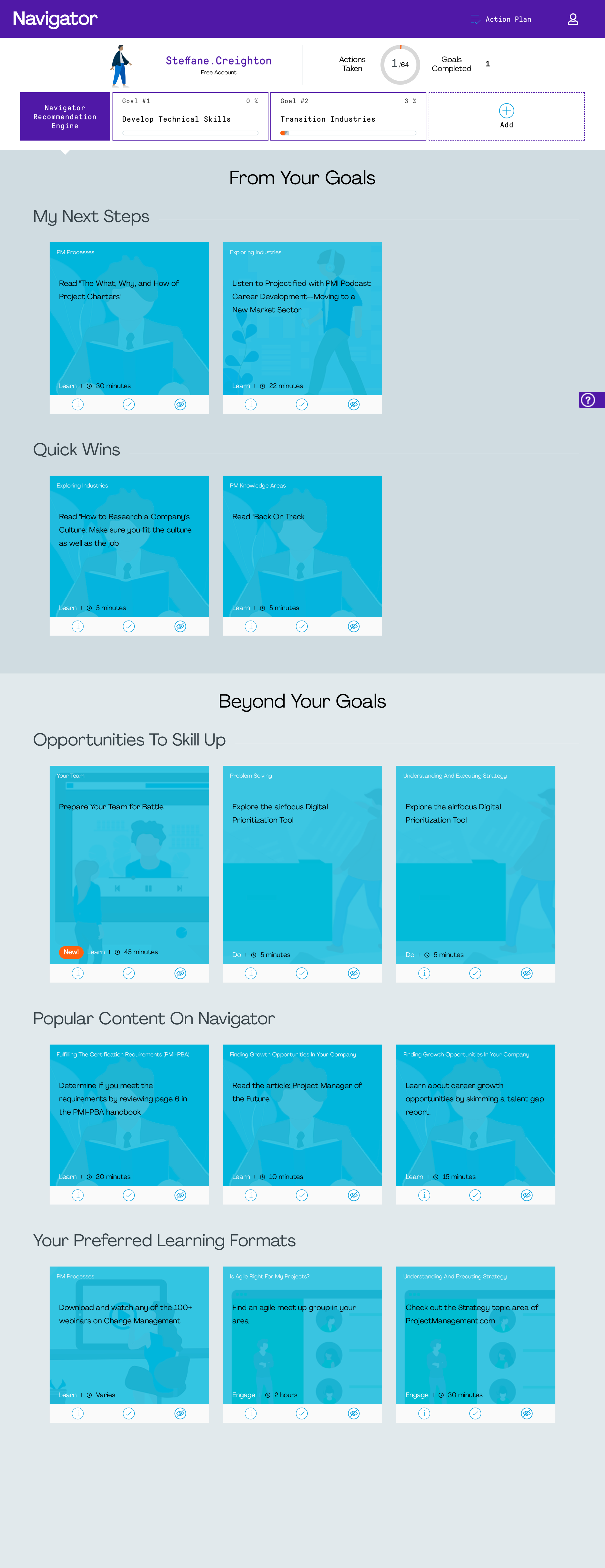
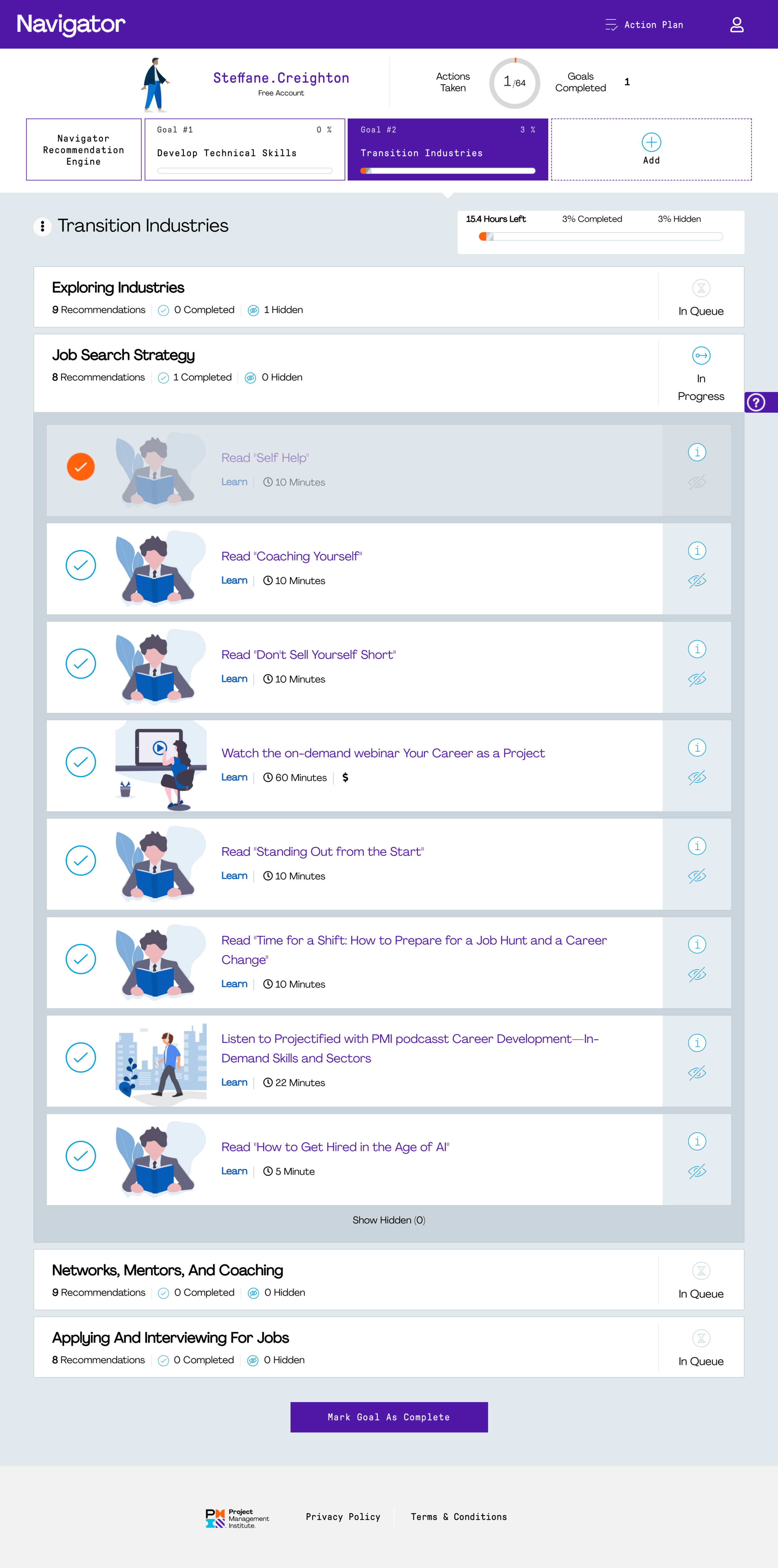
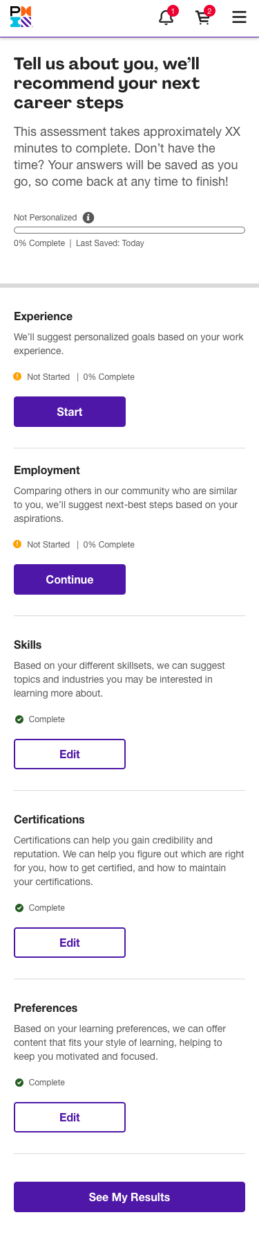
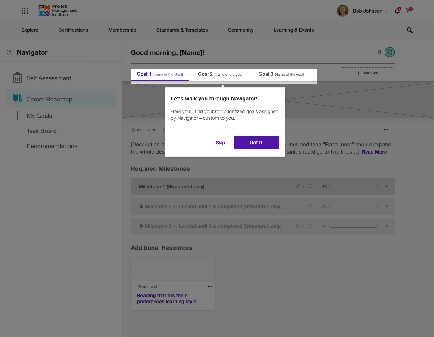
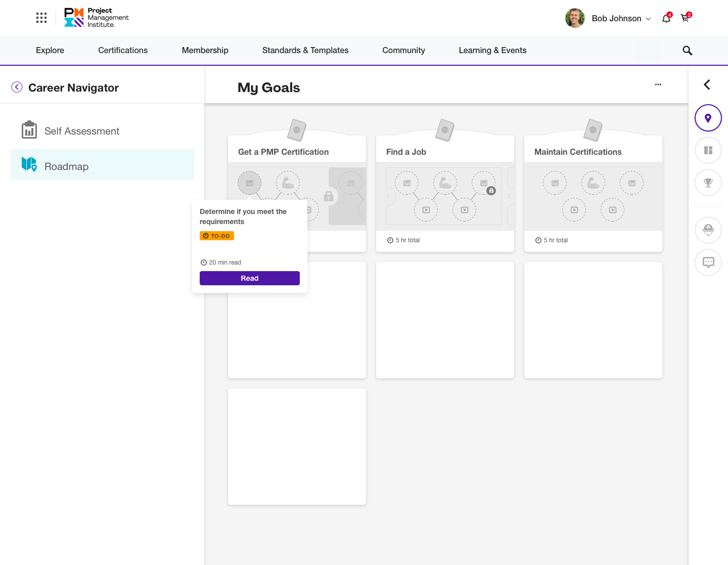
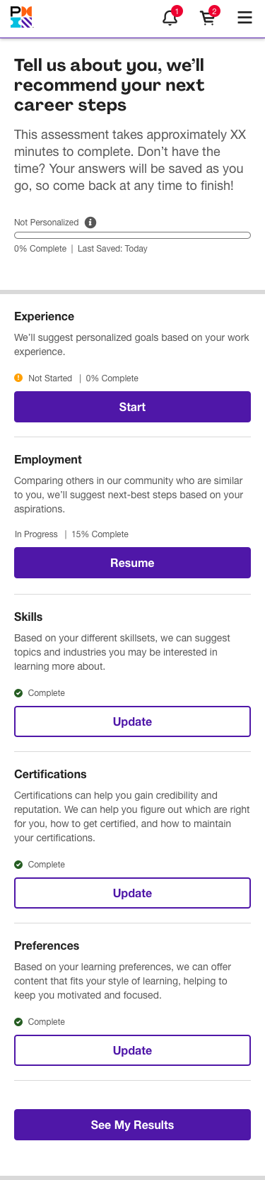
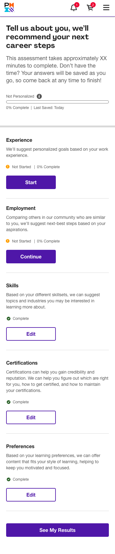
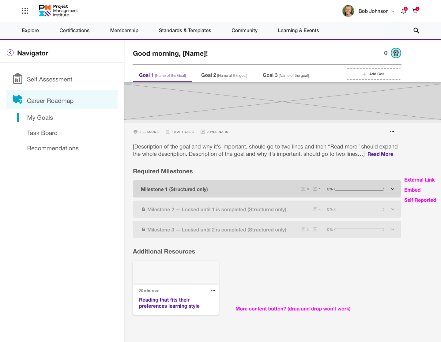
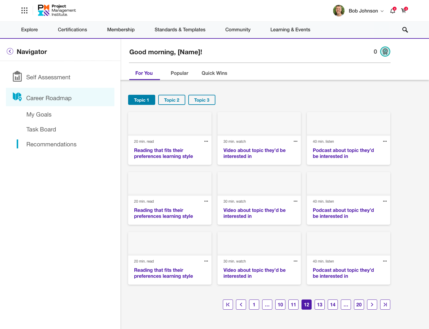
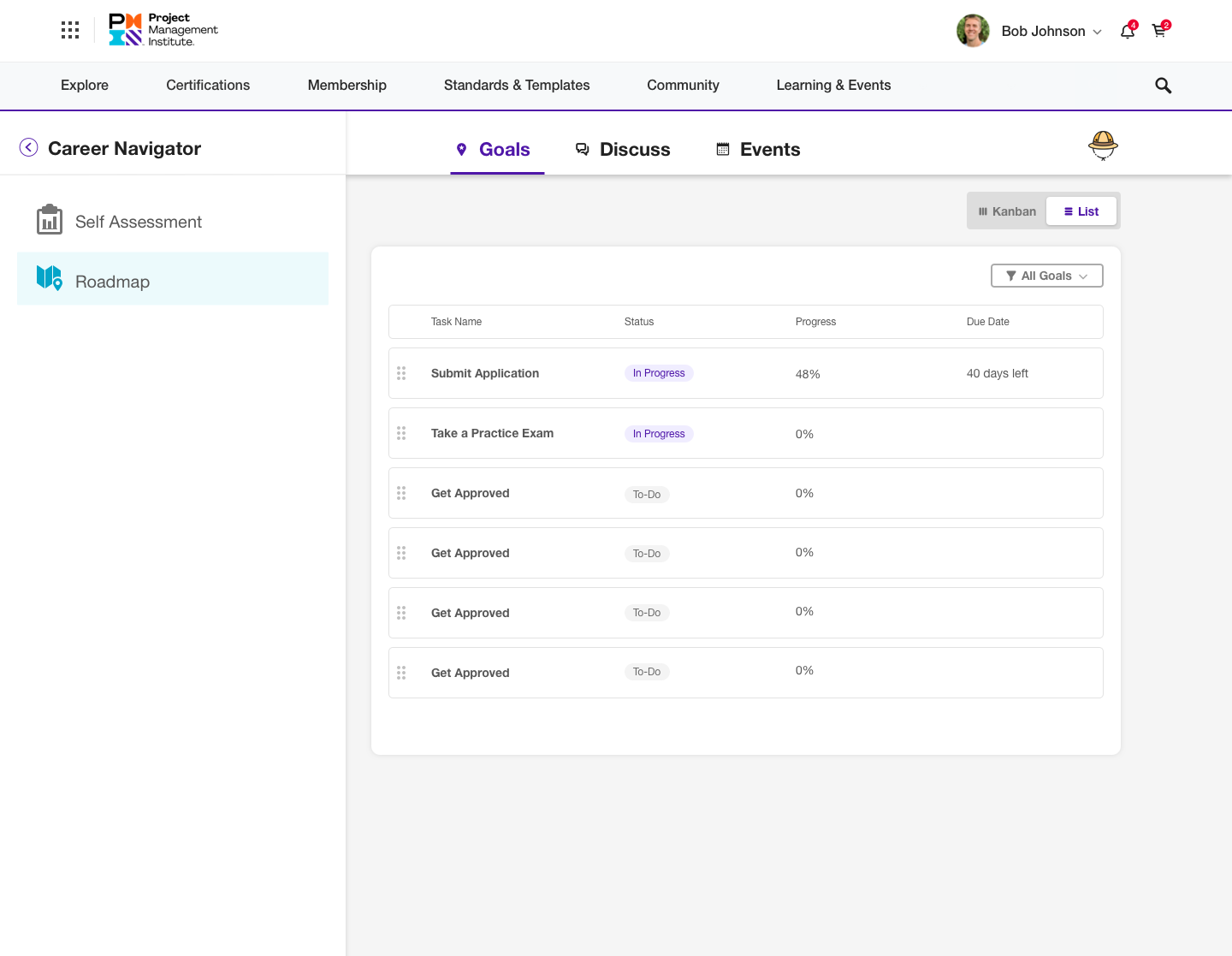
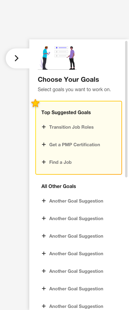
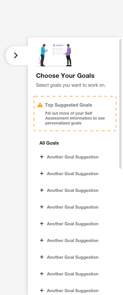
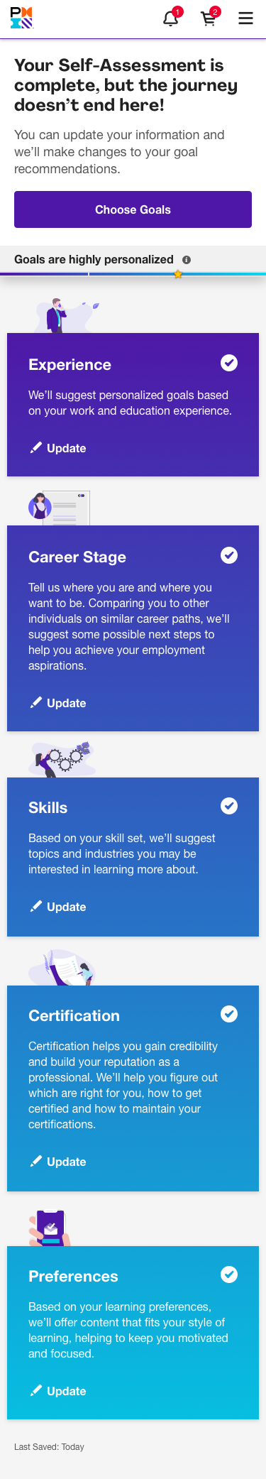
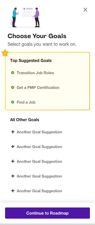
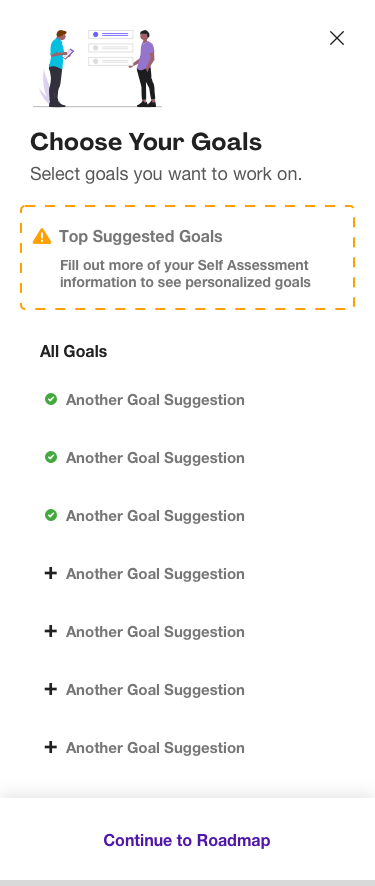
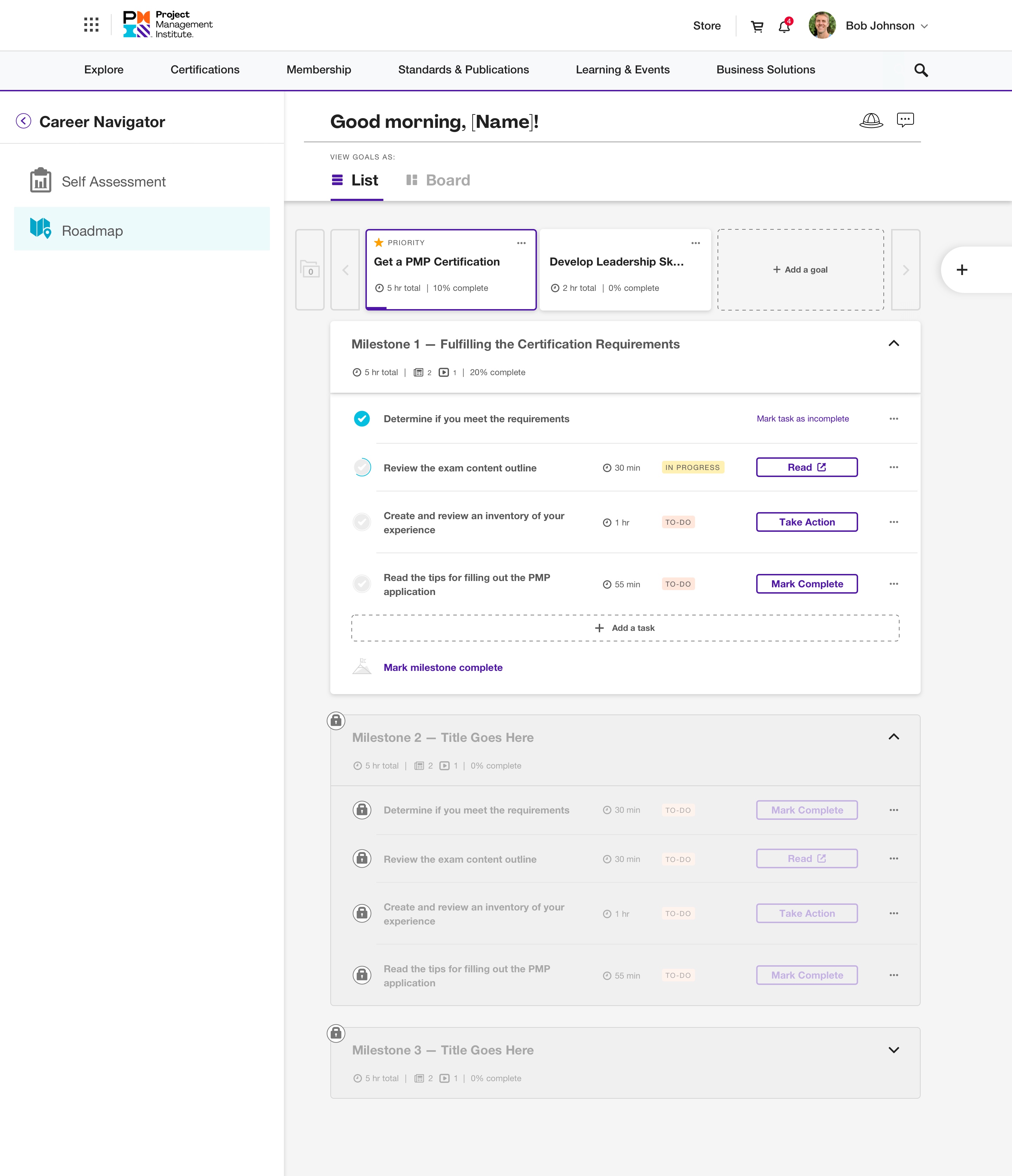
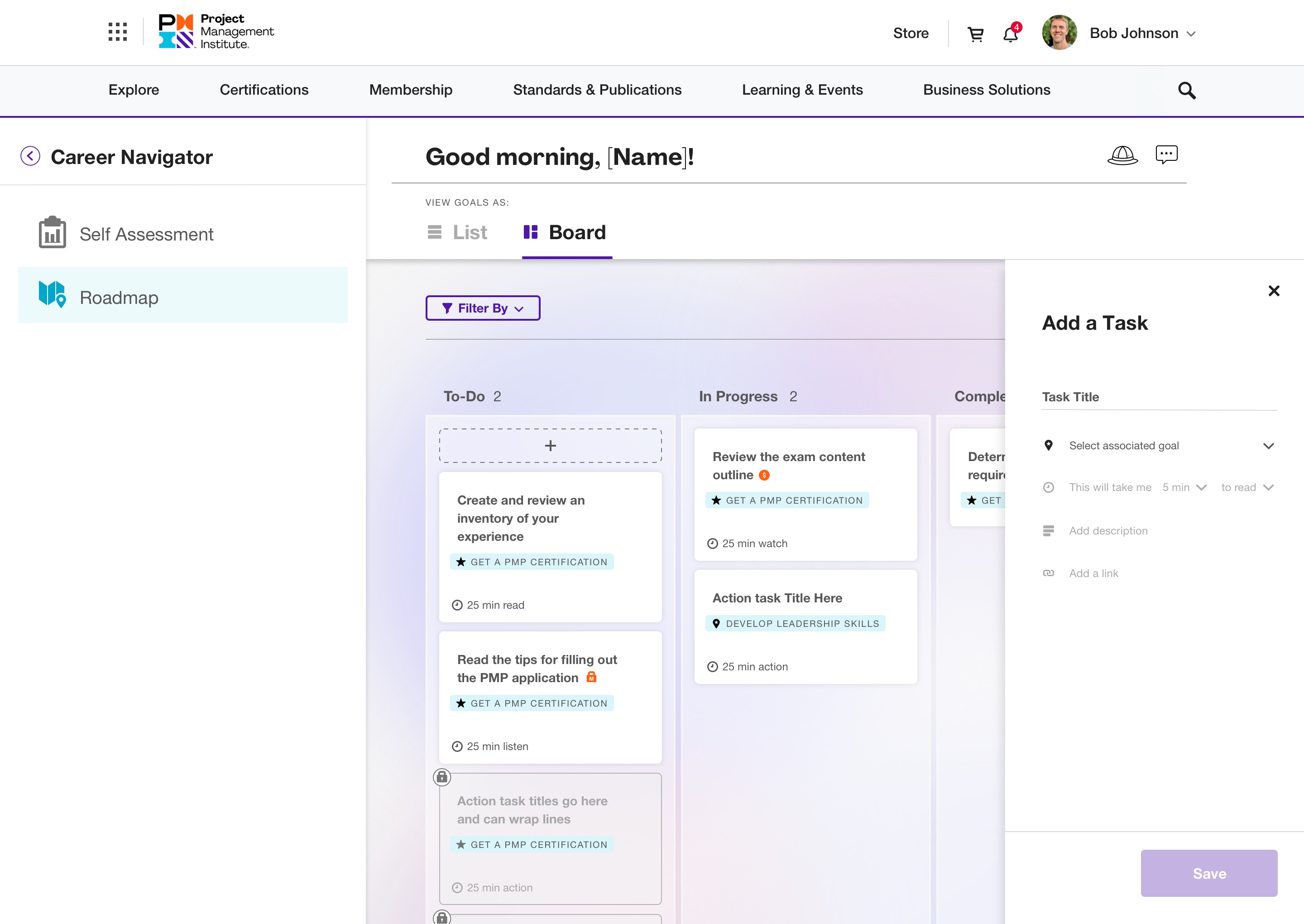
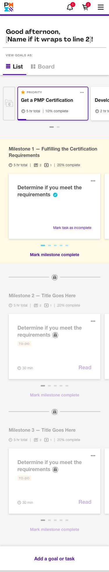
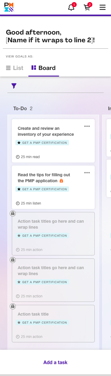
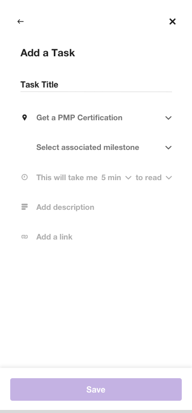
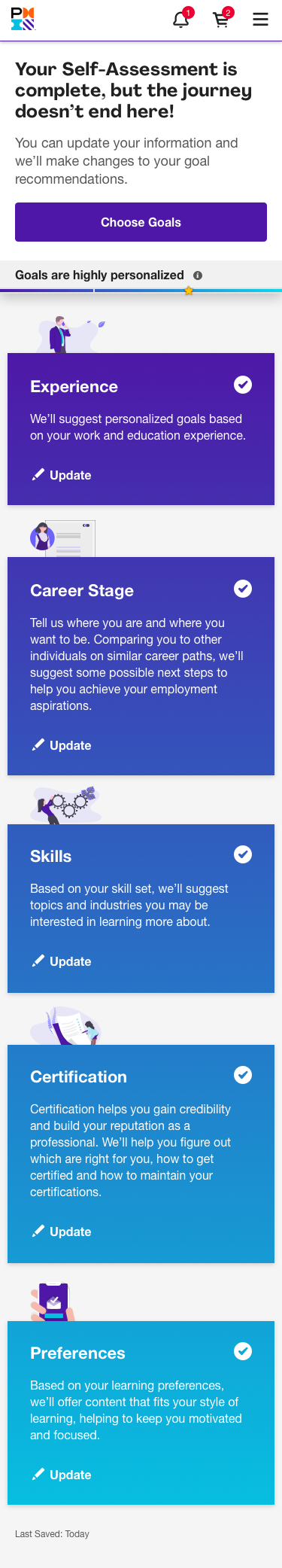
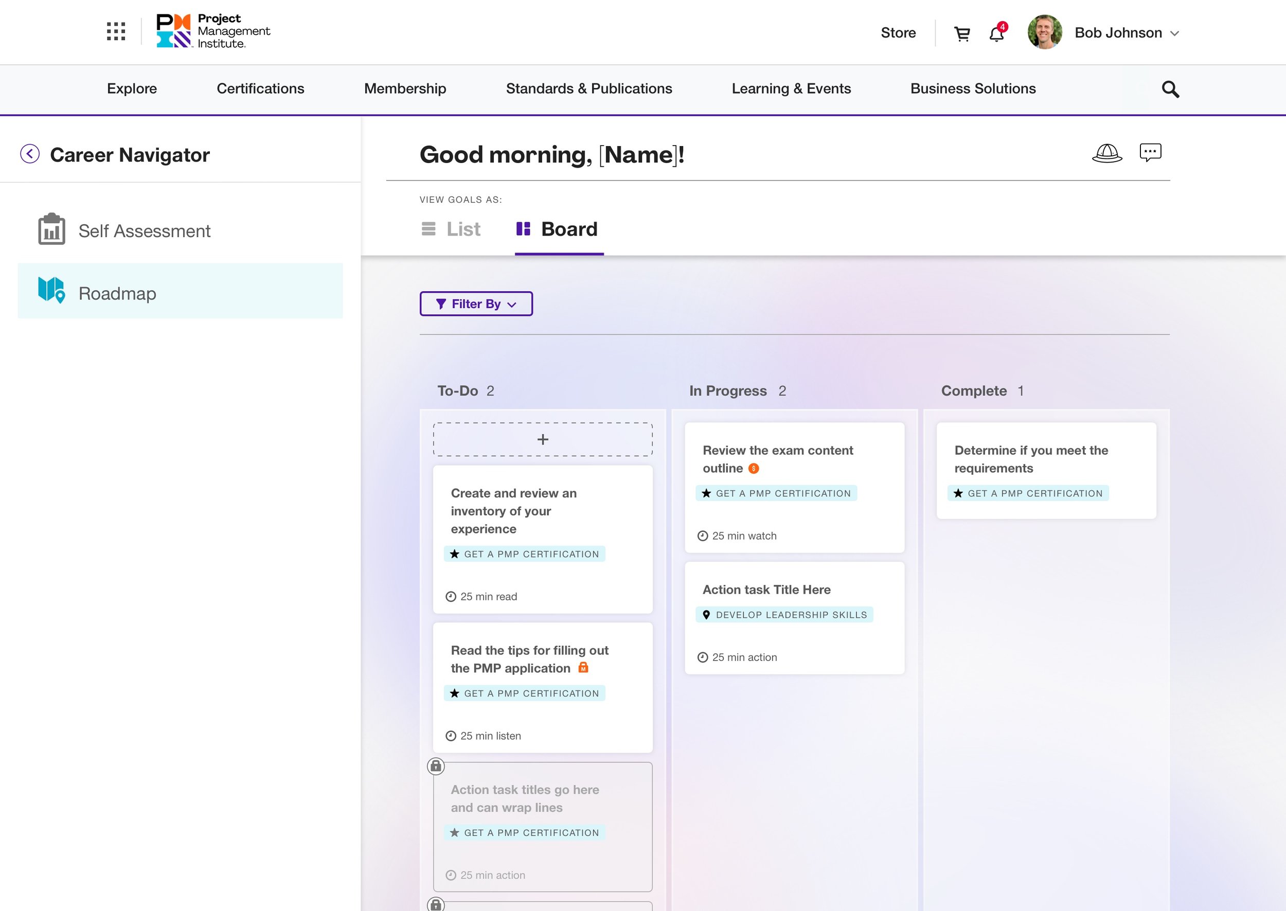
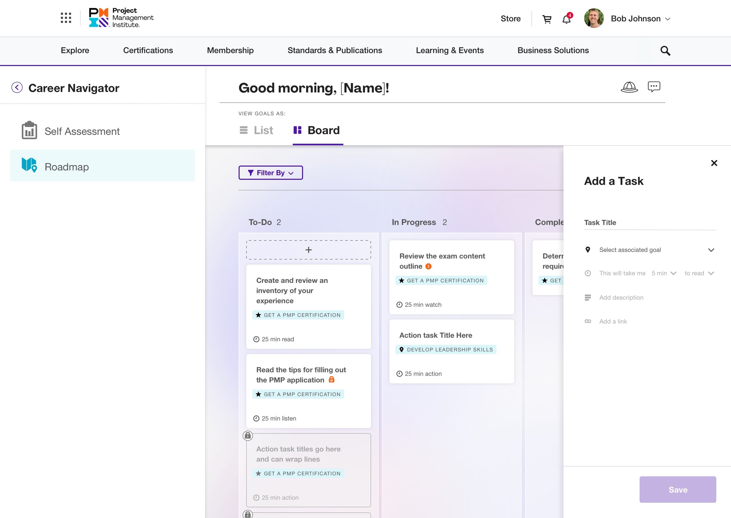
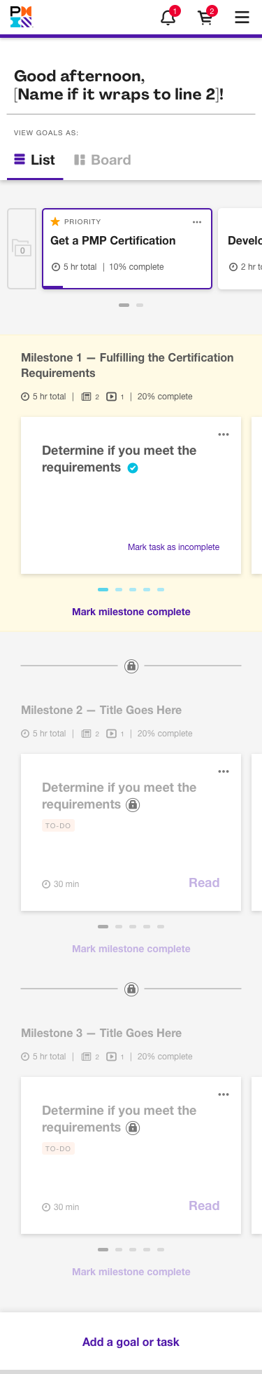
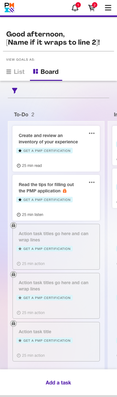
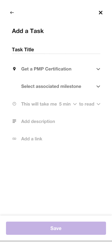
Career Navigator begins with a self-assessment addressing career stage, skills, certification, and professional development preferences. After completion of the self-assessment, users are directed to a customized roadmap, which includes a plan for each of their goals. Action items within the goals consist of articles, webinars, podcasts, courses, memberships and any PMI product to help users achieve their goal.
Below are screenshots of the product Career Navigator in its beta state. The initial research that I worked from was gathered from our beta users.


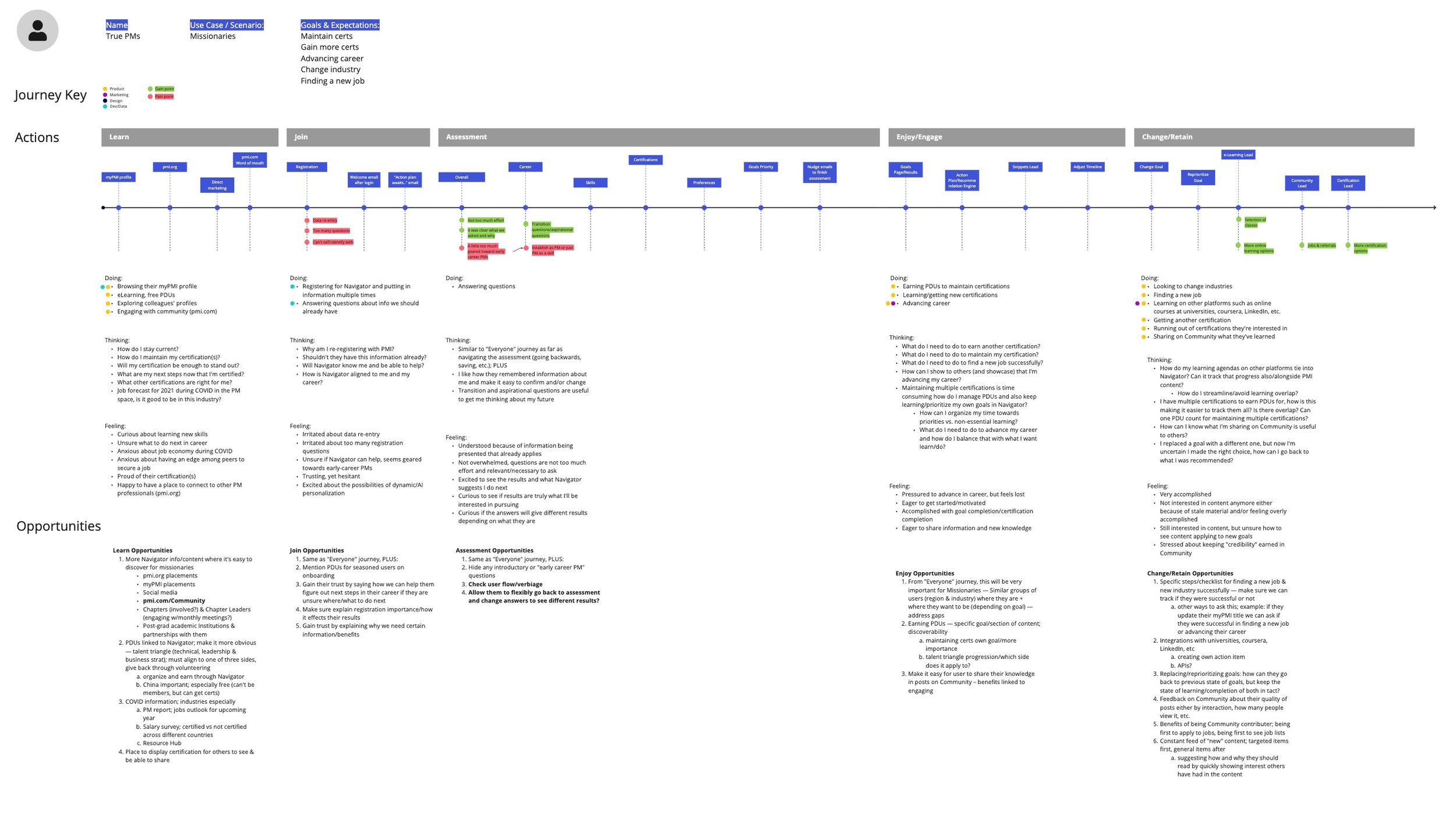
Kickoff Research
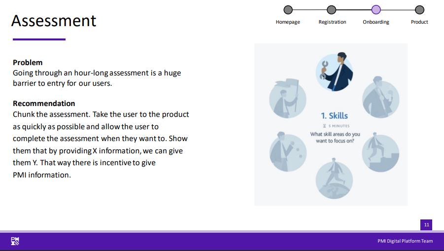
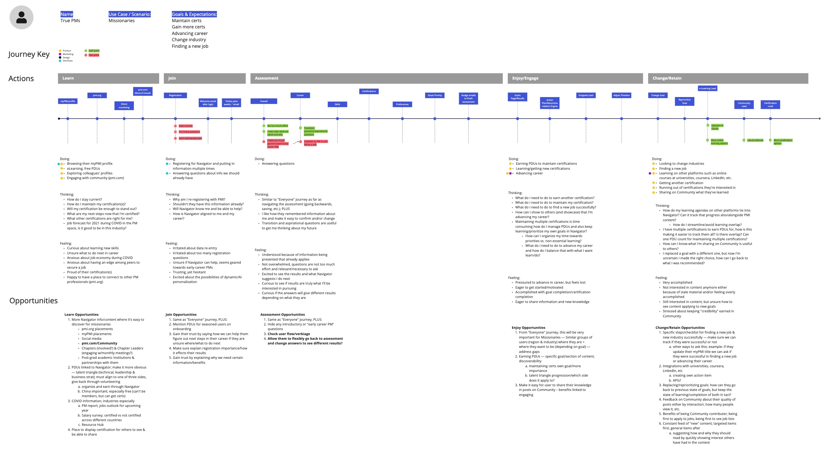
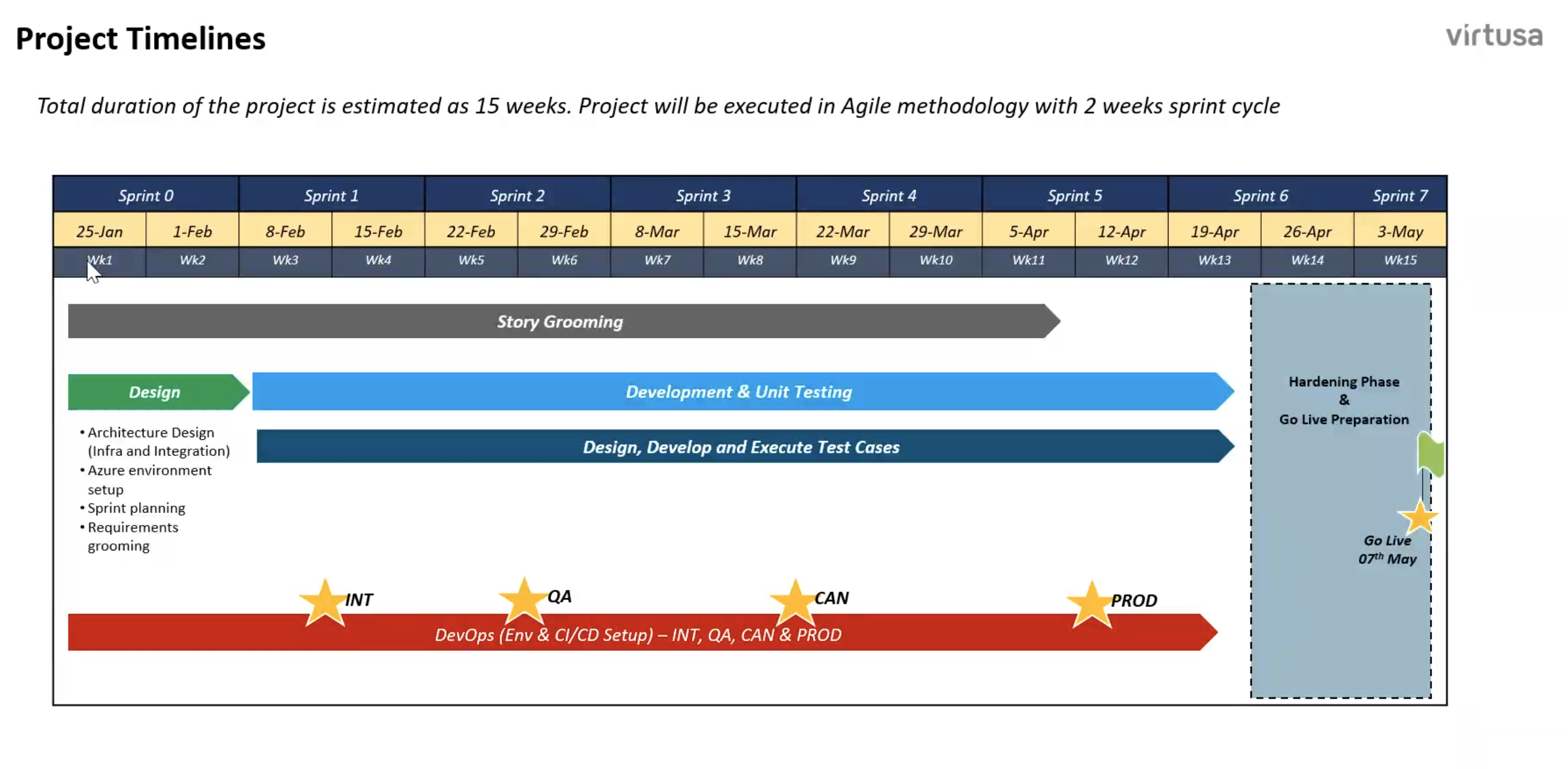
Our team (Kevin, Peter and I) created user journeys of our key target audiences based on prior PMI segmentation to identify gaps between the feedback from our users and the flow of the product. We identified many pain points that needed to be addressed before launch (see timeline below). Based on the user research, user journeys, and the heuristics that I had done, our team came up with a long list of goals. Because we work in an agile environment, these goals needed to prioritized accordingly. Some goals were included in the MVP, others were not.
Feature the value of the product up front with easy-to-understand onboarding
“Gating” the main goal of the product behind a lengthy assessment caused abandonment; release the gate and allow users a taste of the product, give them the choice to give more information to get more out of the product
Interaction within goals and between goals is not clear to understand
Don’t have self development in a vacuum; utilize the AI and data to drive a peer benchmarking system that compares users. The system would then identify gaps between the user and their peers (coming in 2022)


User Flows and Wireframes
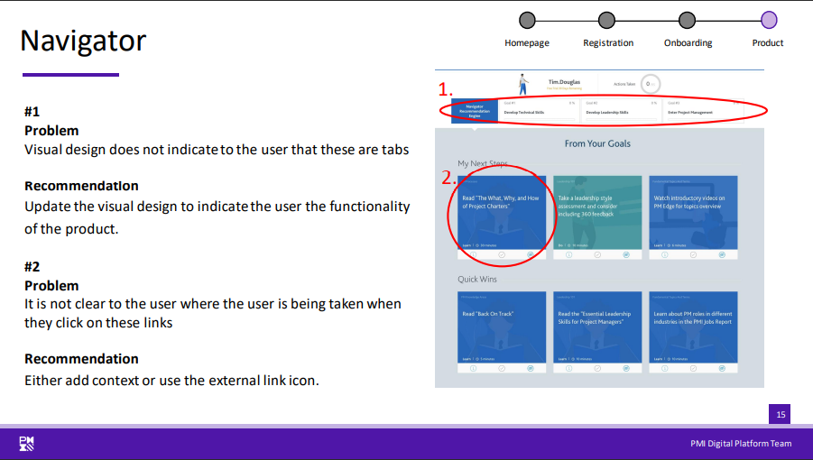
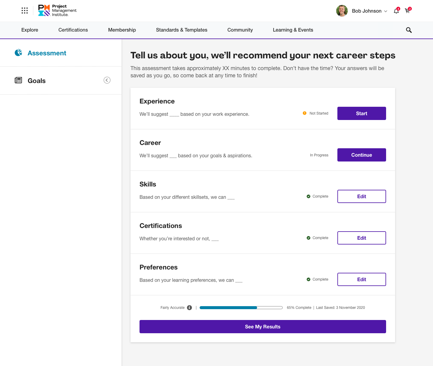
I created a documentation of the beta product flow to identify improvement areas and compare my redesigned flows. From the flows I created lo-fi wireframes to run by the product owners and researchers.


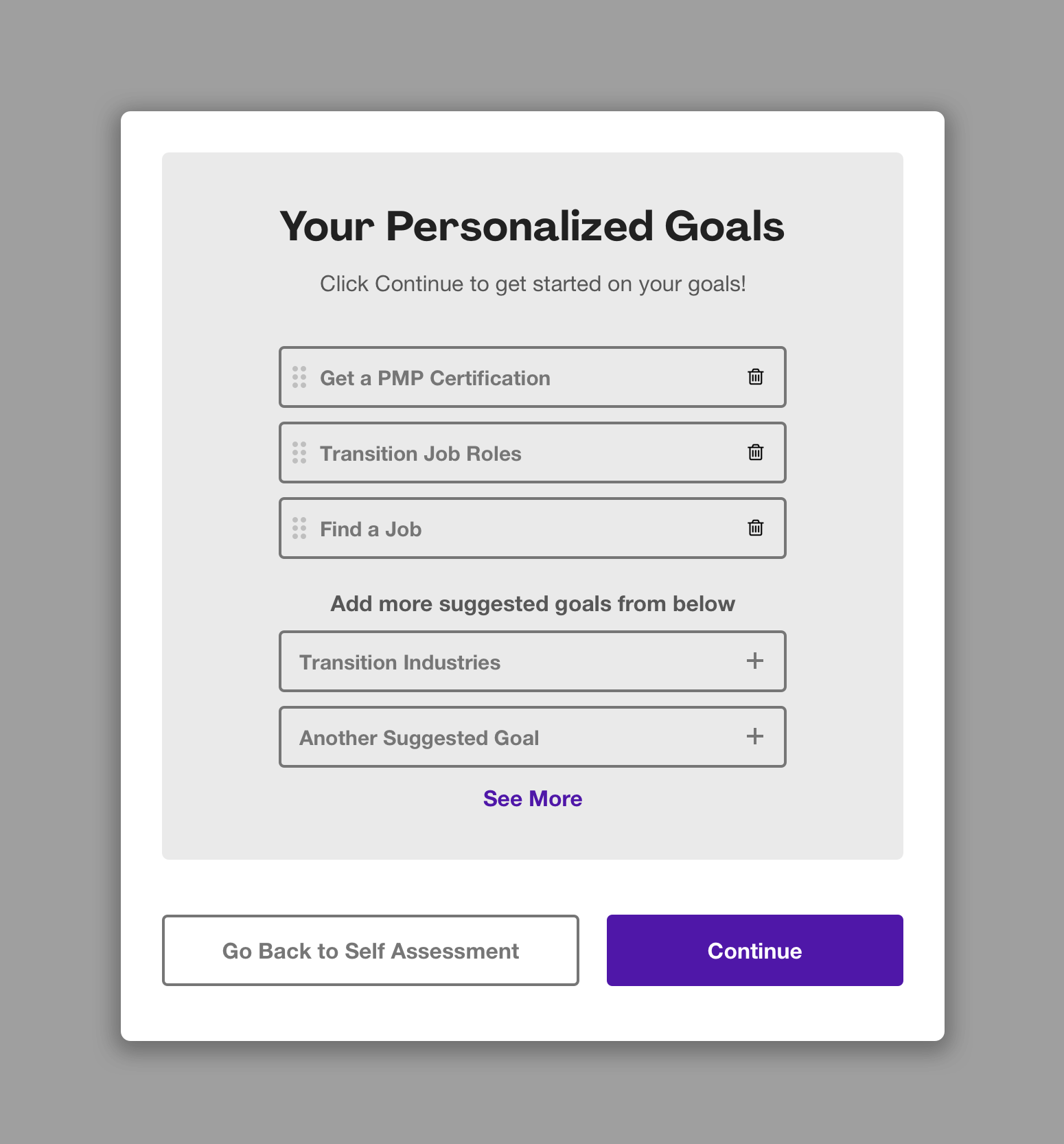
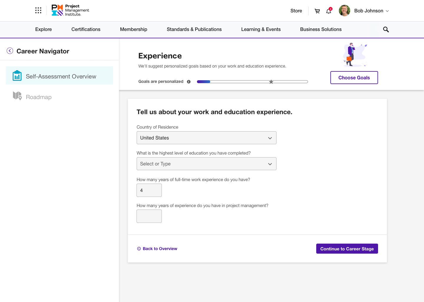
Prototyping and Mockups
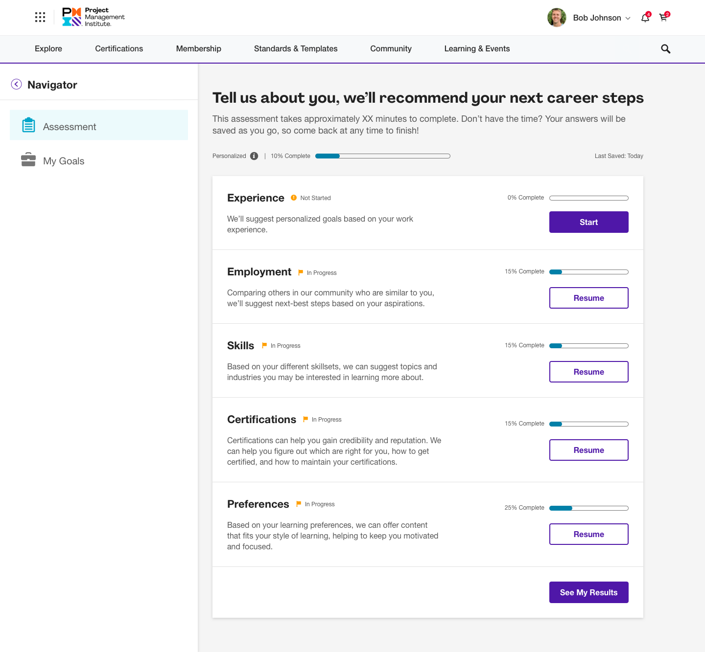
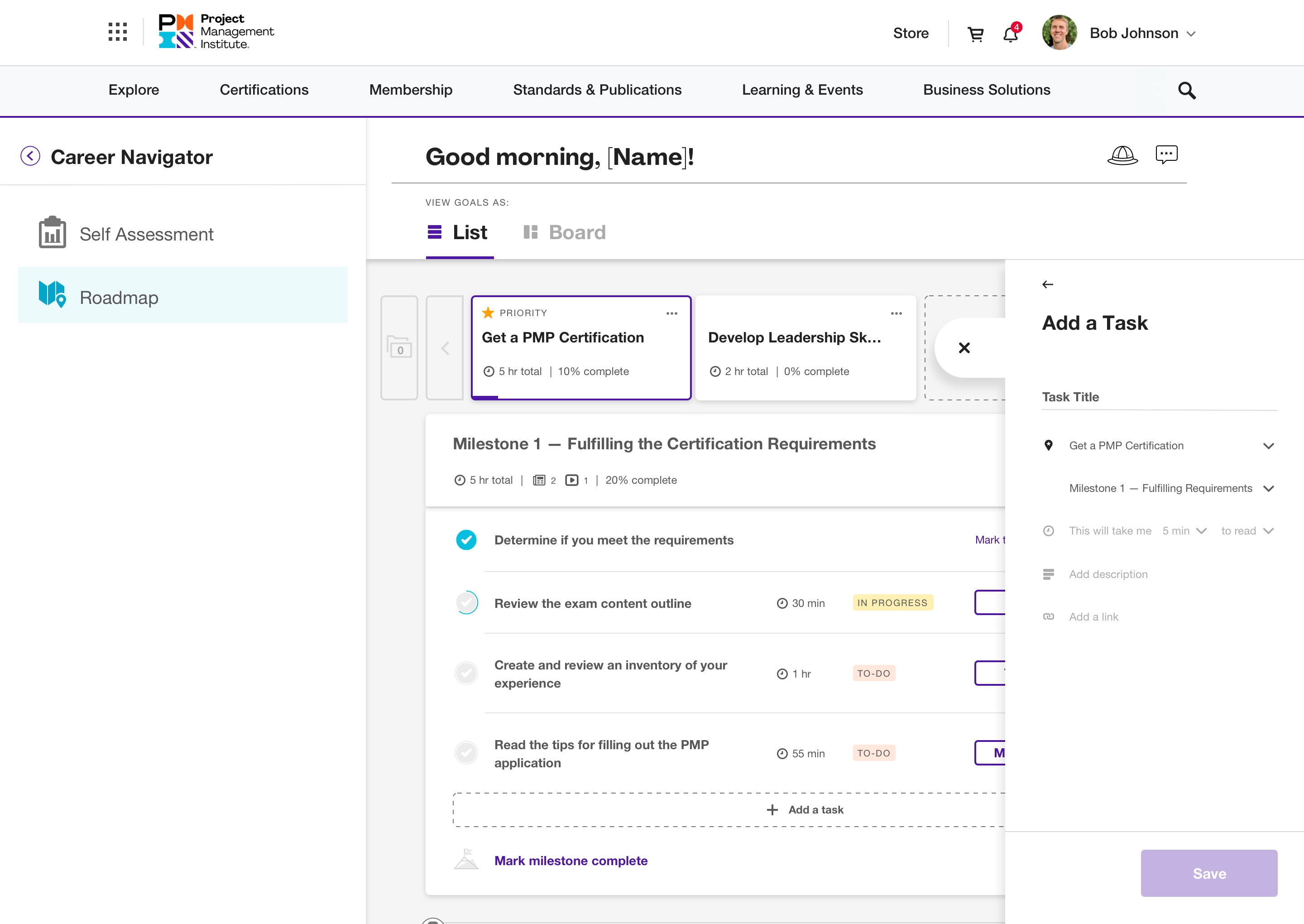
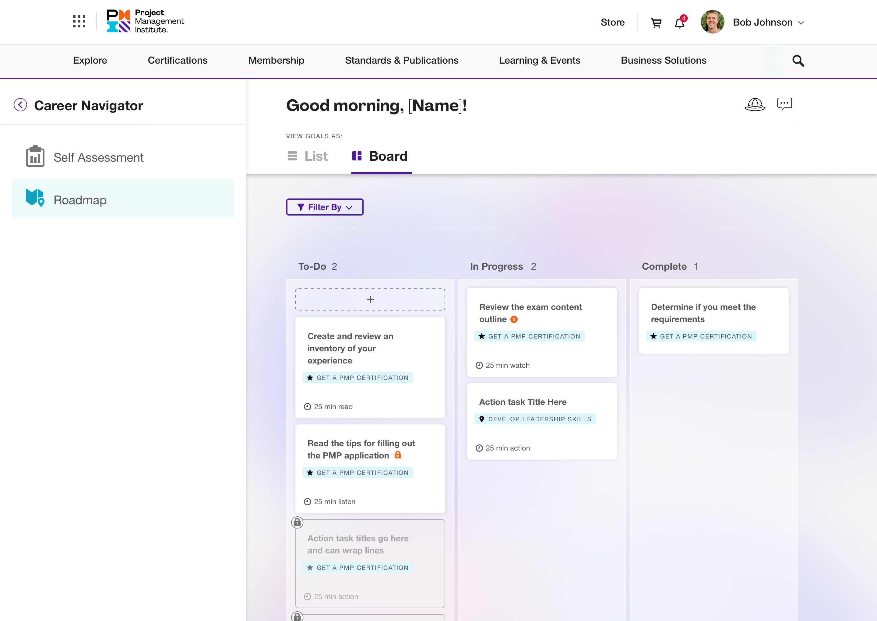
From the lo-fi wireframes and feedback from the team I created high-fi prototypes/mockups that could then be discussed with the development teams in our daily standups (dev questions for me) and grooming sessions (problem solving and compromising).
Please note this is a very small sample of screens (there’s thousands at this point).


Animation and Interactive Design
Arguably one of my favorite parts of my job is adding interactive elements that help users subconsciously understand what is happening as they interact with the product. It’s also a great opportunity to add a unique feel and character to the product to push its branding. A fraction of the in-production and yet to be developed examples are below.
Onboarding Animations
Roadmap Tour Guide (not yet developed)
After Purchasing Bundle: Task Split
Mobile Lazy Load and Back to Top Icon
Results, Continuing Development and Research
The team agreed on some KPIs to track to help us measure success. Launch day went without a hiccup and since then (June 2021), there’s over 120,000 active users.
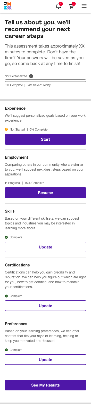
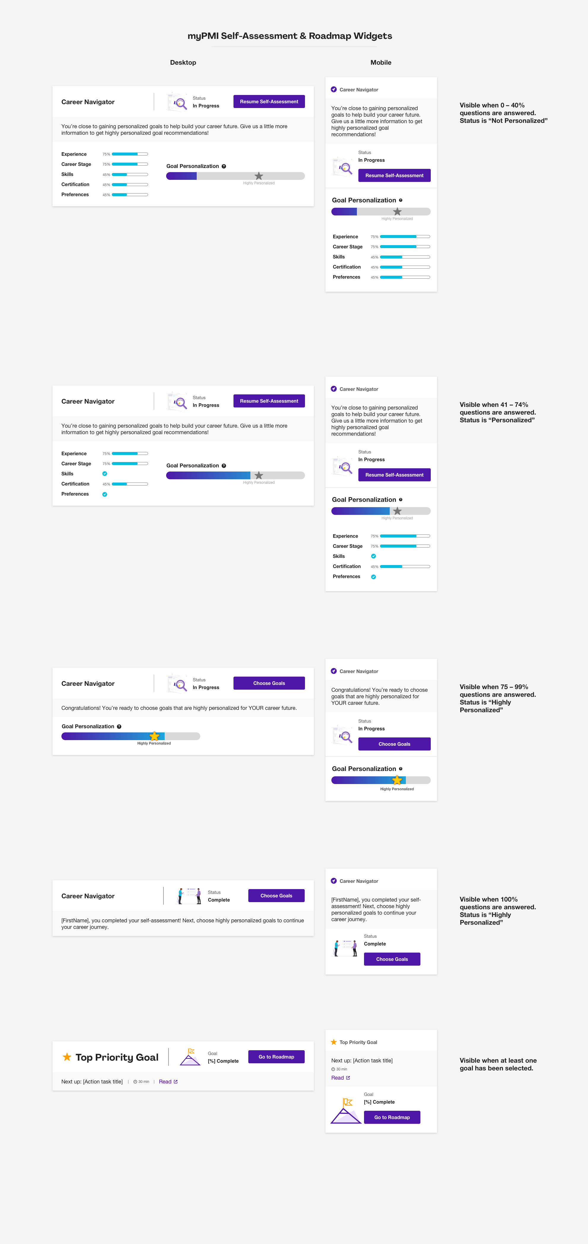
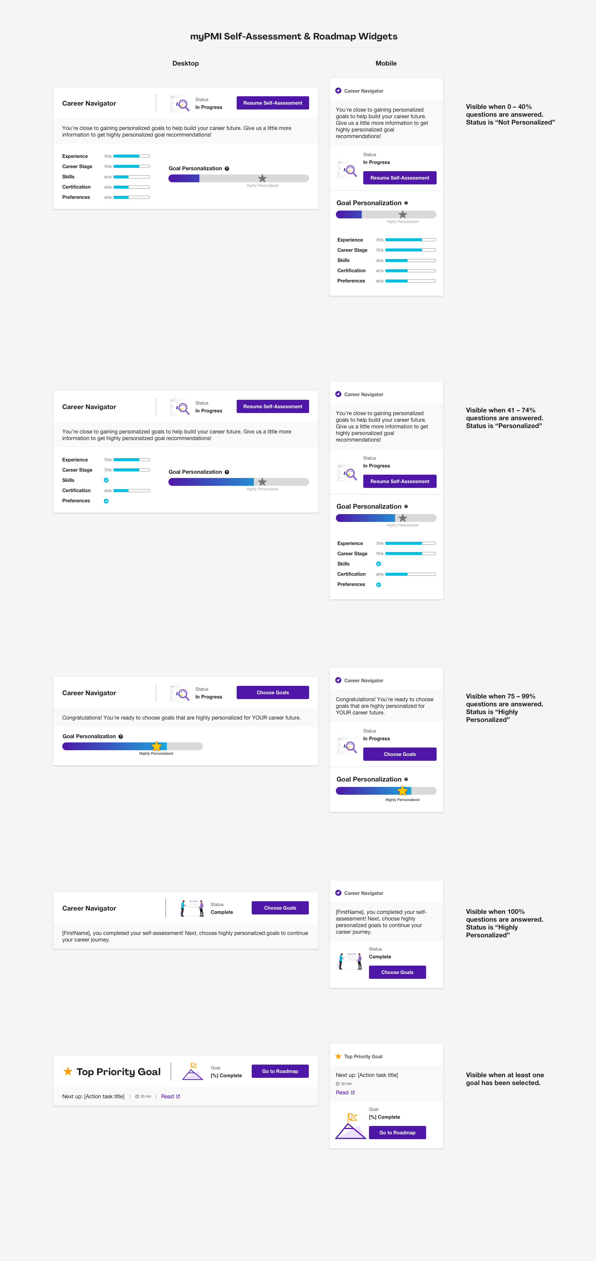
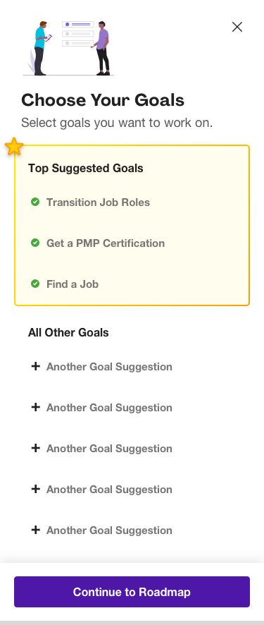
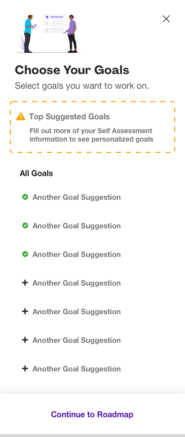
One example of our ongoing research dealt with the Self Assessment section of the product. We had put in place tracking ahead of time to track users that made it past the Self Assessment to the Roadmap and started to work on their goals. We noticed the percentage of users making it that far were a little lower than we hoped. After conducting some user interviews we noticed there was confusion about some design elements that prevented the users from knowing exactly how to proceed. We took the feedback and revised the flow, design elements and copy to be more simplified and the results were an increased percentage in our users making it through the Self Assessment! Yay!! See before and after examples of some of the changes we made below.
Desktop


Mobile


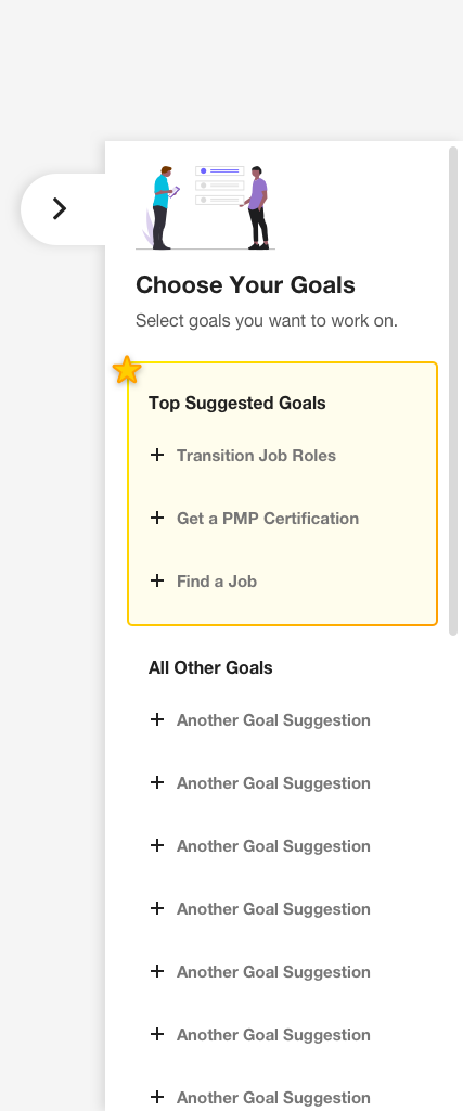
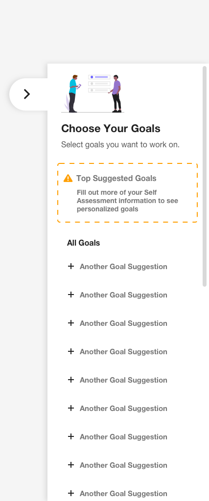
Another example of our ongoing research was a usability test for a new feature which would allow our users to add their own tasks. I created an interactive prototype for the users to interact with during the research interviews. See the InVision here (password is “interview”)
Career Navigator is free for all registered users. You can register here to see it live in production.
ComcasT
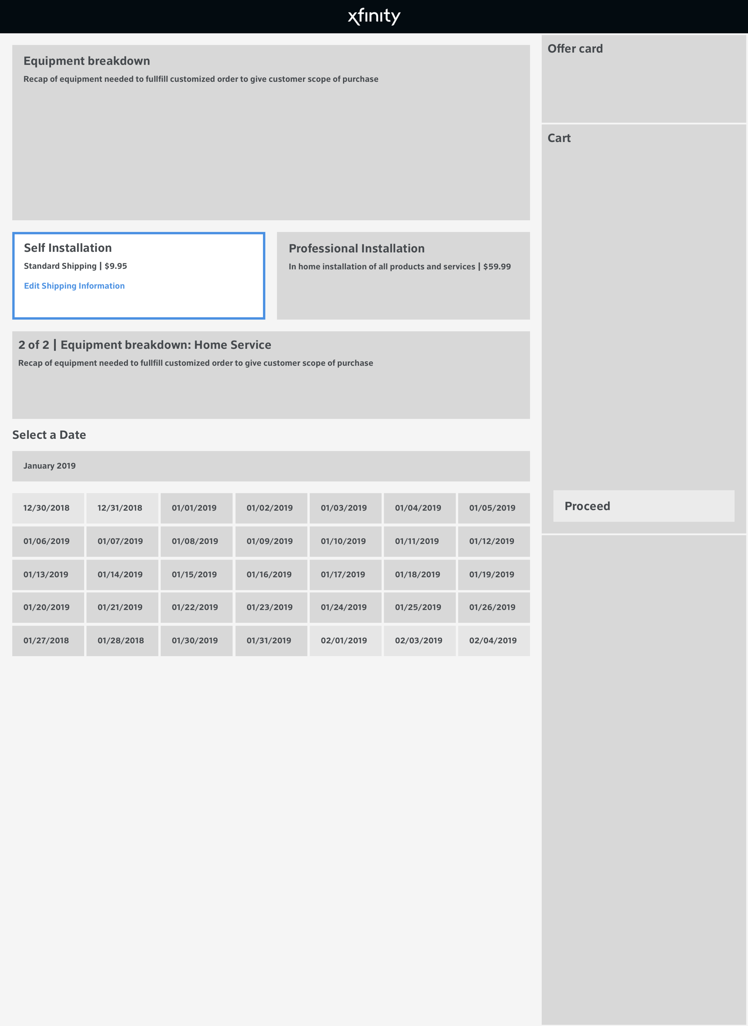
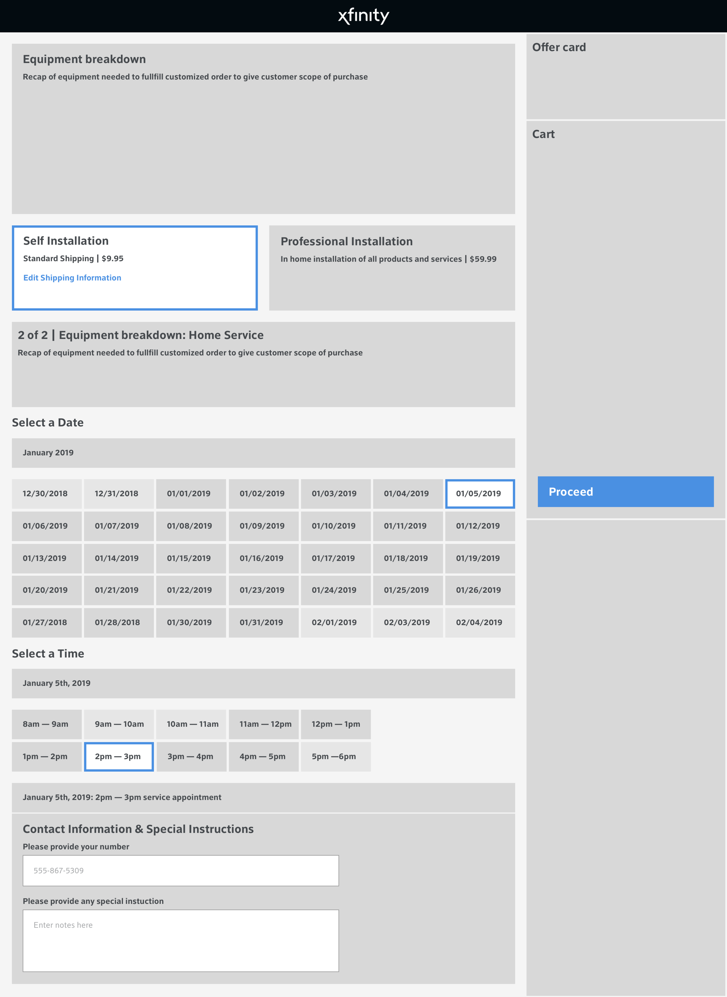
Case Study: Buy Flow Installation Step and New Features
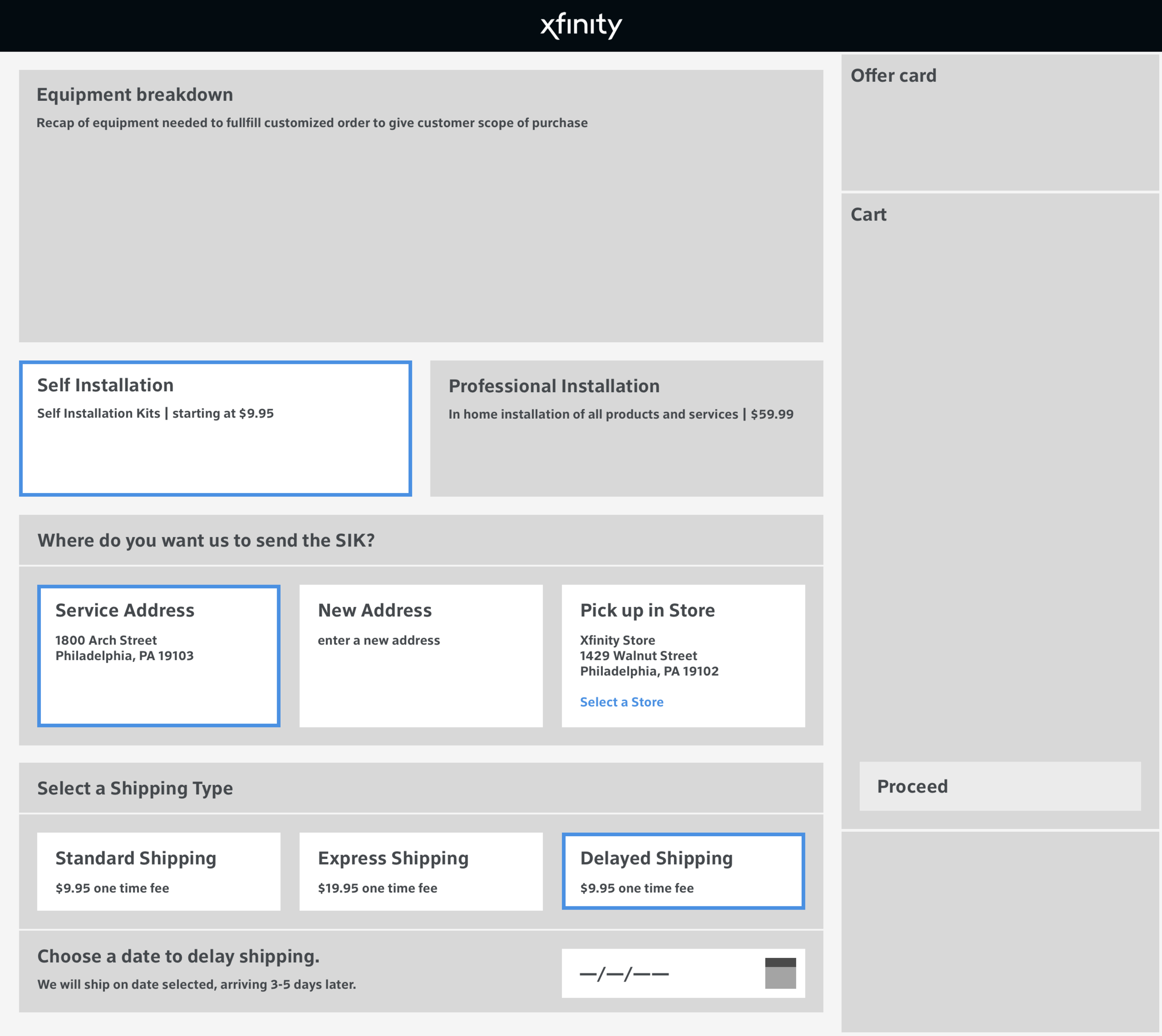
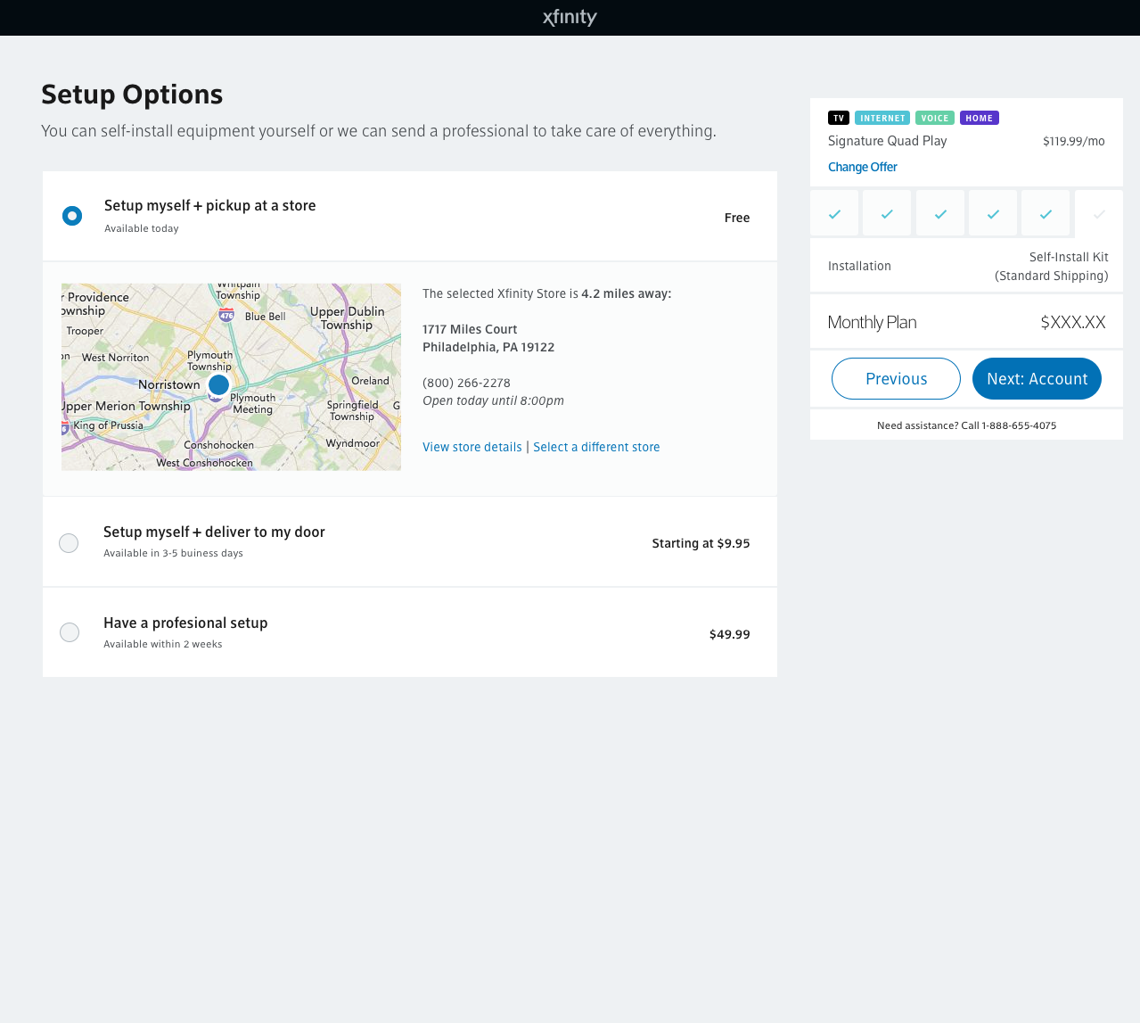
Below are screenshots of the installation page prior to my team’s (Maj, Aric, Kyle, Owen, Henken, Lisa and myself) UX/UI redesign.
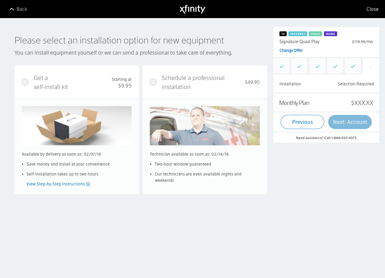
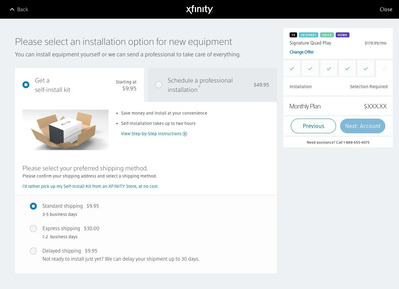
Our development (dev) team (Mike, Joe, and Nivi) and product team (Cheryl, Walter and Caitlin) came to us with a problem. In the future, the page would need to be able to accommodate multiple installation options: a customer wanting both a self-install kit and professional installation would be required for the other half of their order because of some sophisticated products would require setup by one of our techs in the users’ homes. As you can see above, there are radio buttons indicating an either/or option, not a combination of the two. The goal was to be able to accommodate many current use cases (keeping in mind marketing promotions as well) including new, more complicated options while also being scale-able for future use cases.
Kickoff Research
Our team spent considerable time getting an audit of the live, in-production (prod) use cases. We also gathered competitive examples of installation and checkout processes. We already knew the majority of our customers who purchase from xfinity.com are mobile users so mobile-first considerations were a must.
Whiteboarding and Wireframes
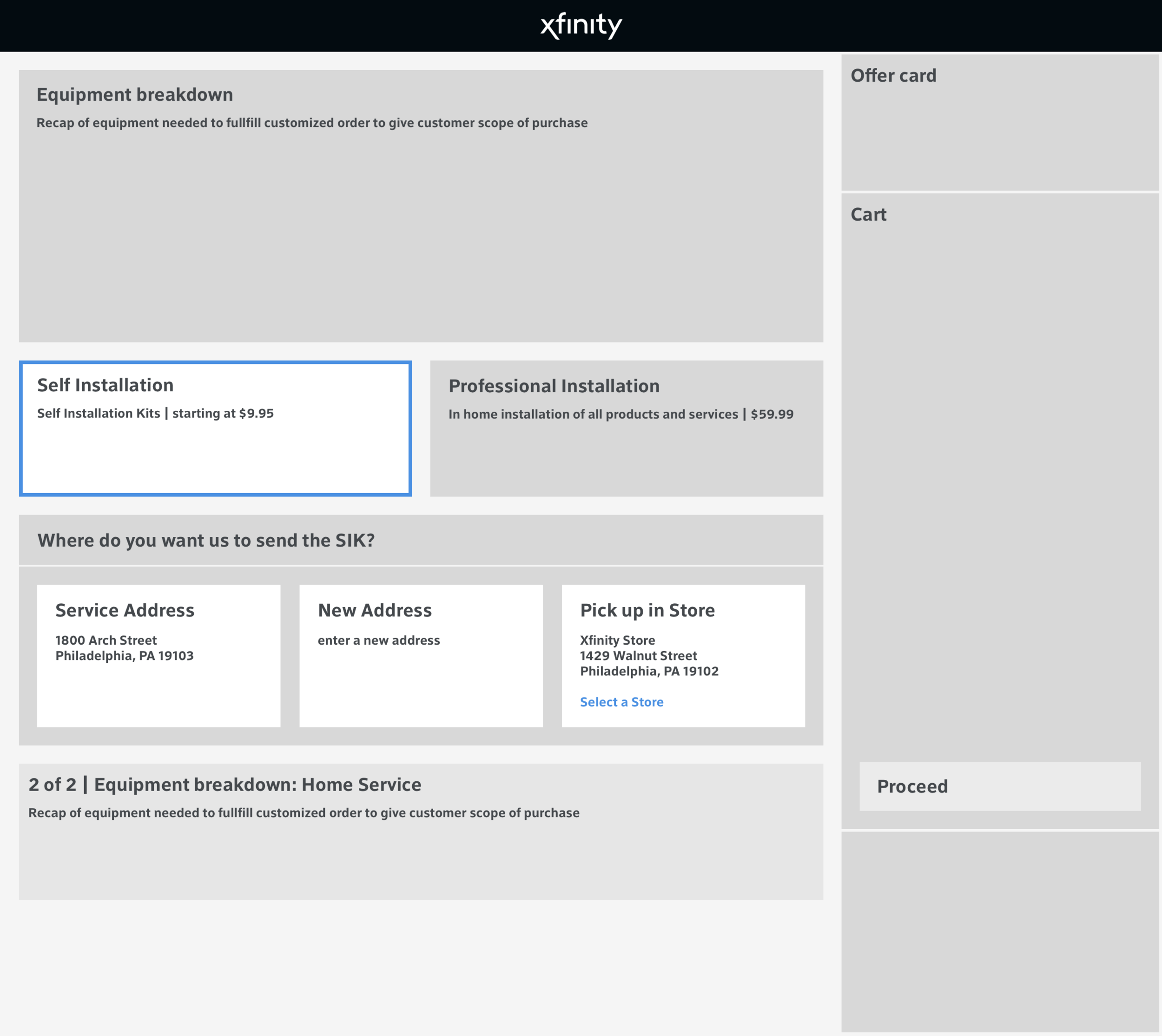
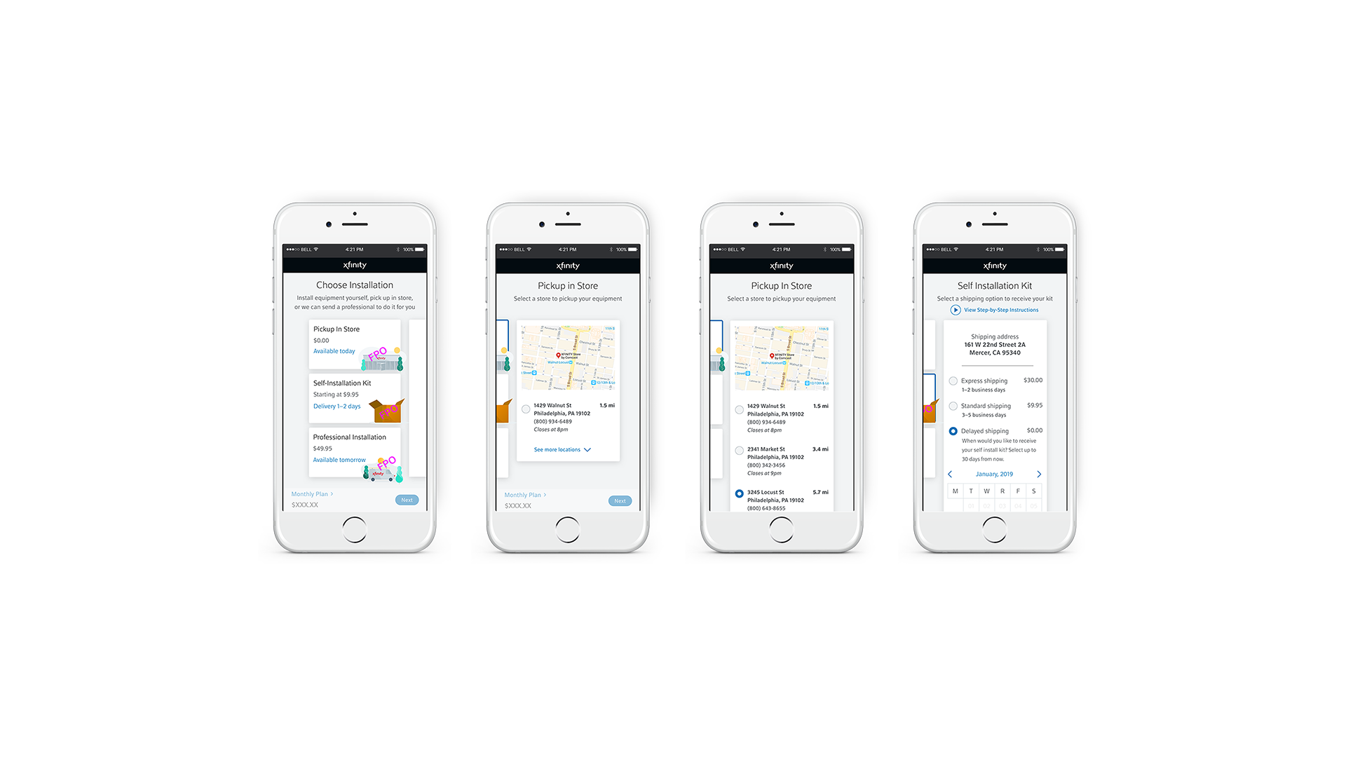
After initial research, Kyle and I whiteboarded together some options in order to wrap our minds around all the numerous scenarios this one redesign would need to solve. We came back to the whole team with our initial whiteboarding so they could easily benefit from our brainstorming and start on wireframes. Everyone participated in coming up with concepts and playing with UX copy that demonstrated natural language (aligning with brand update direction). Below are screenshots of examples from the team.

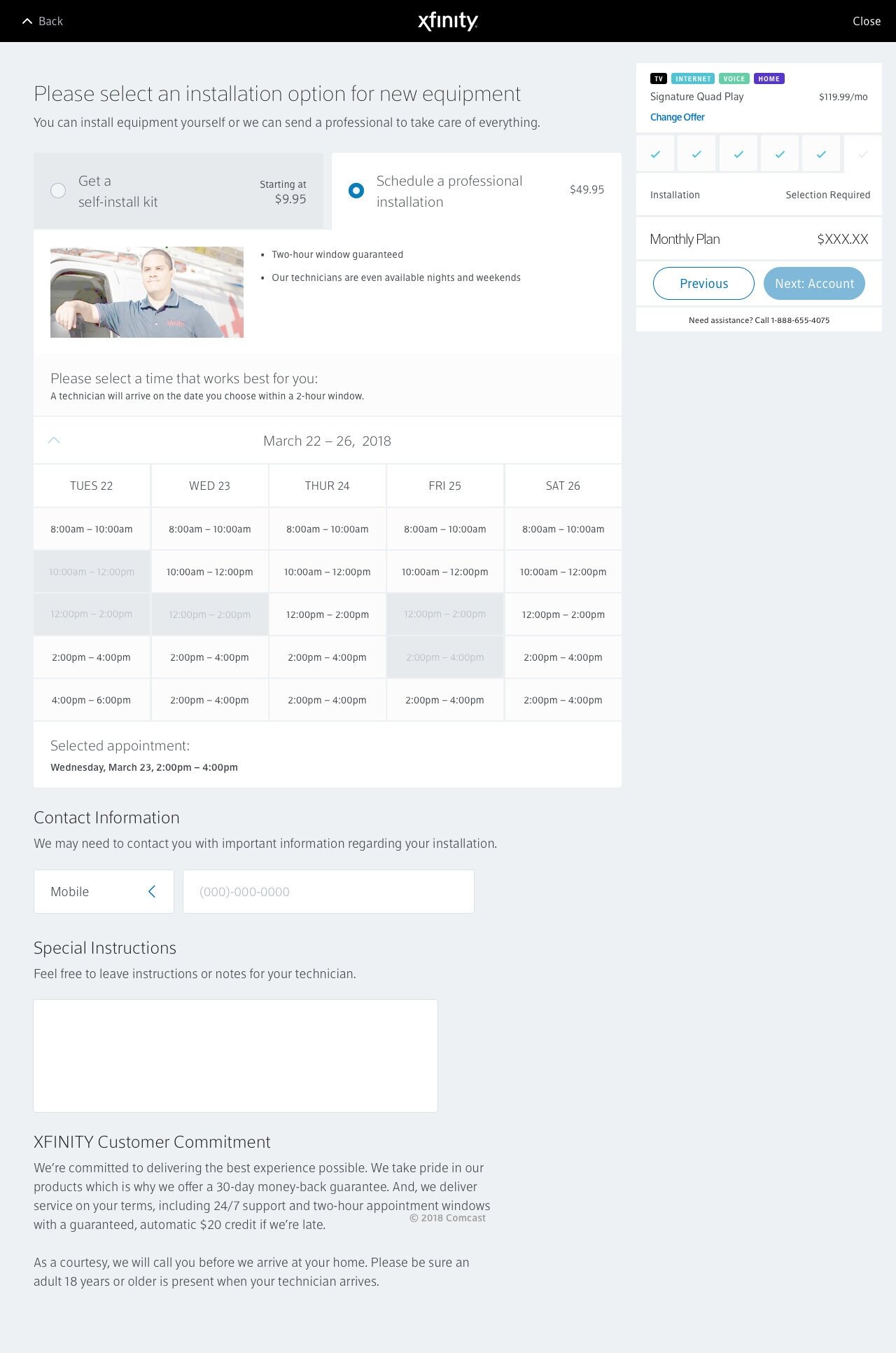
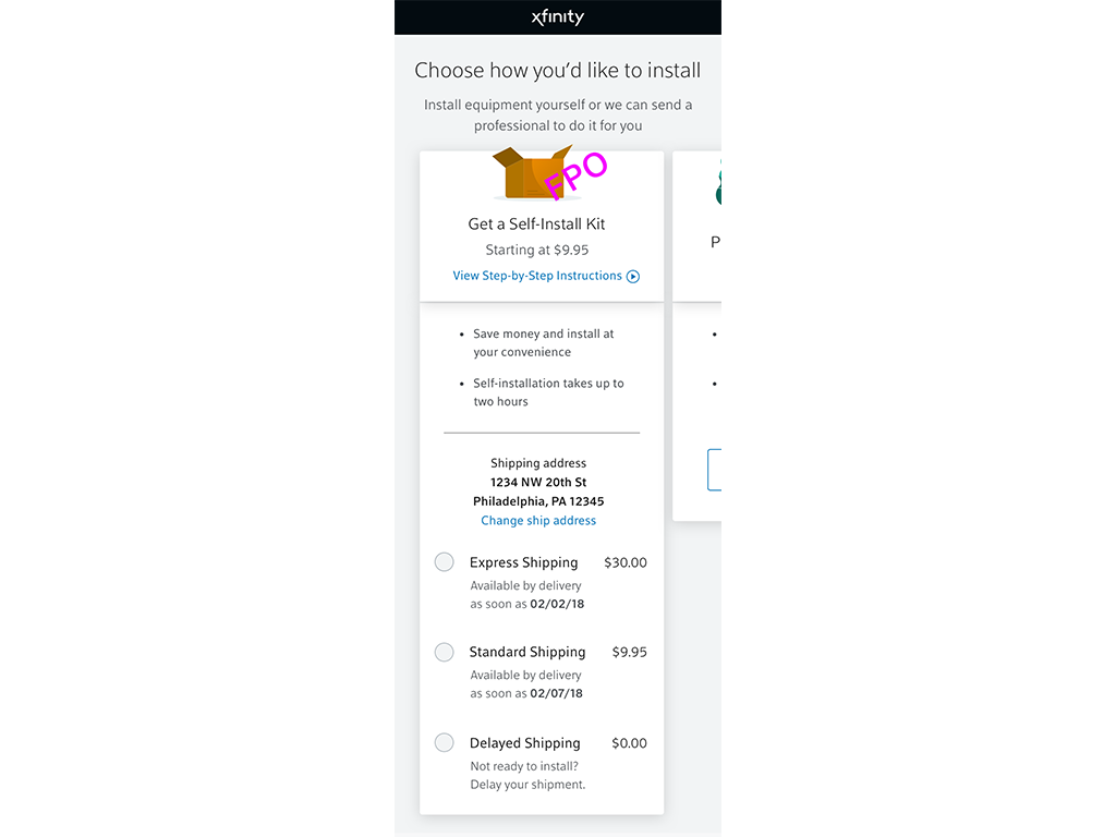
Prototypes and Mockups
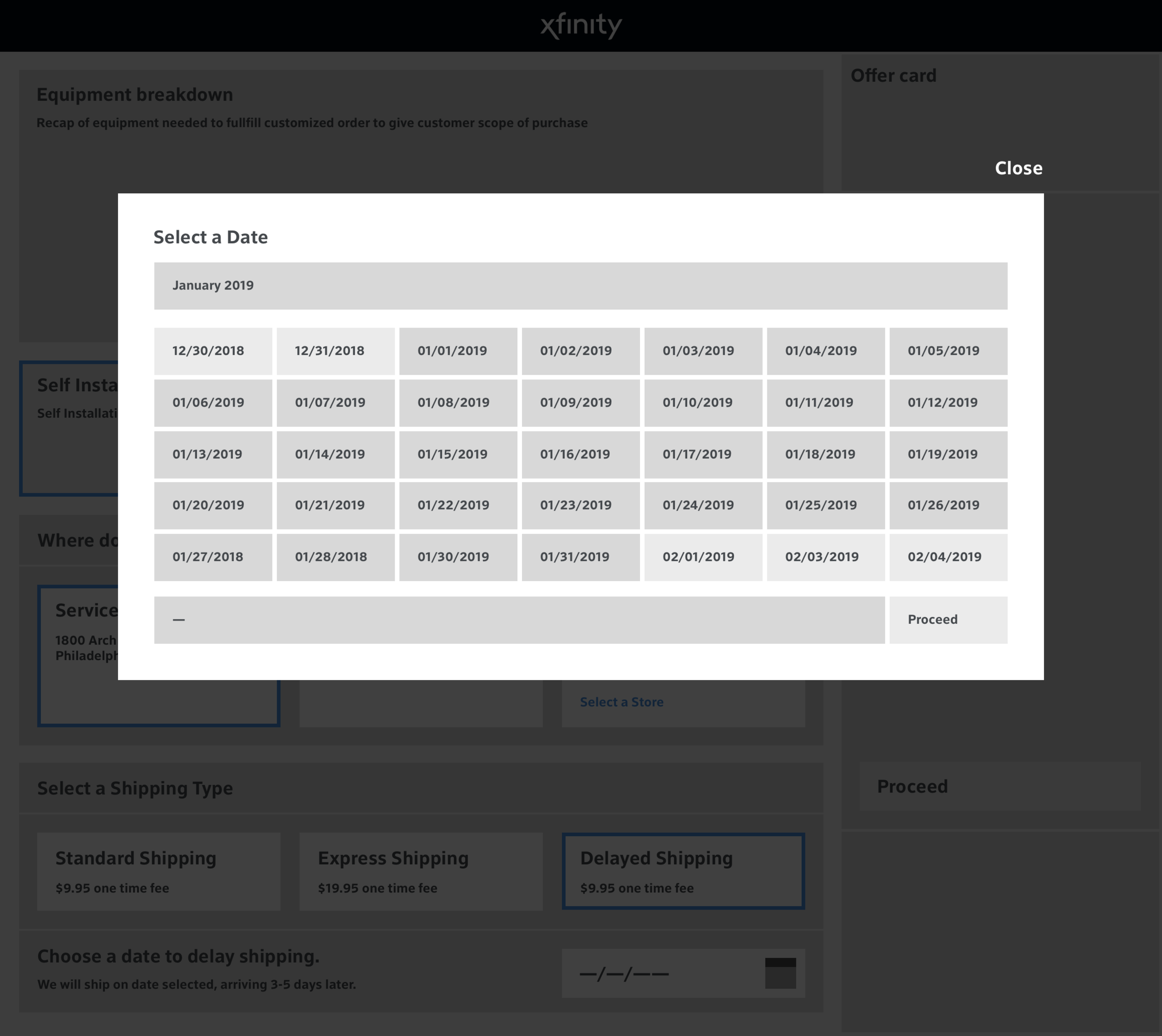
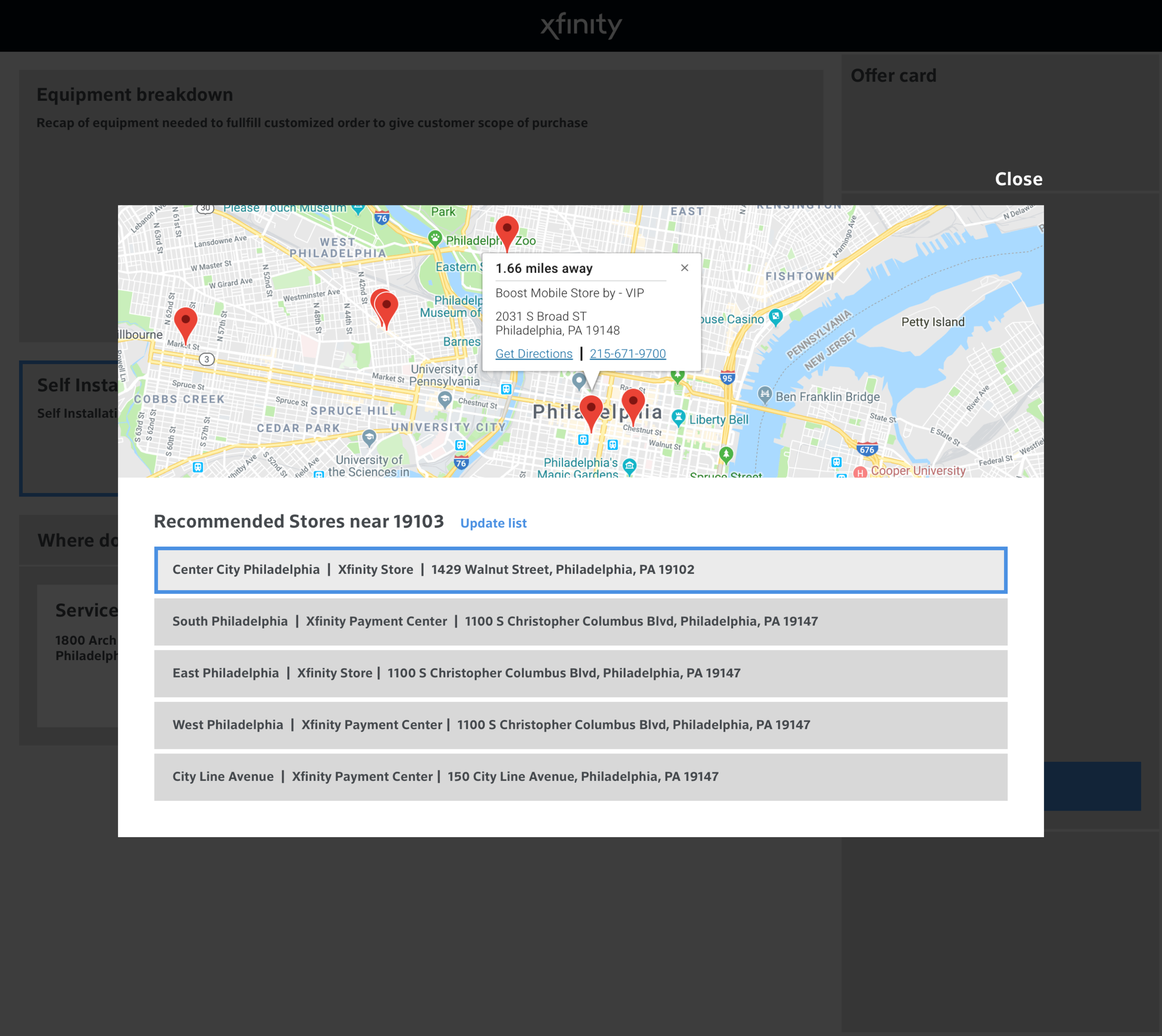
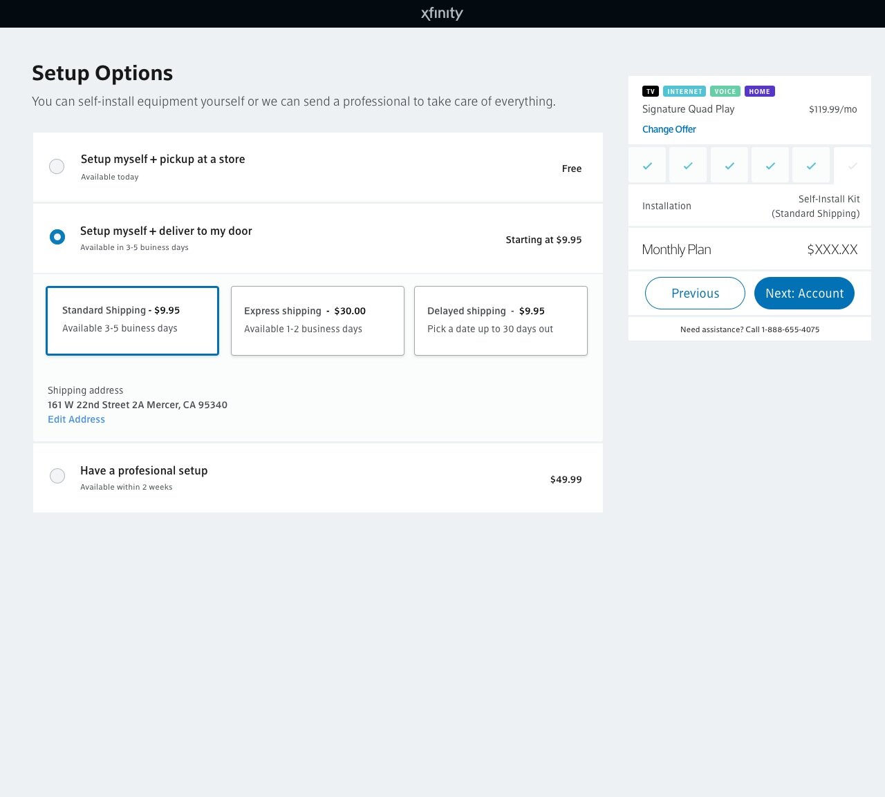
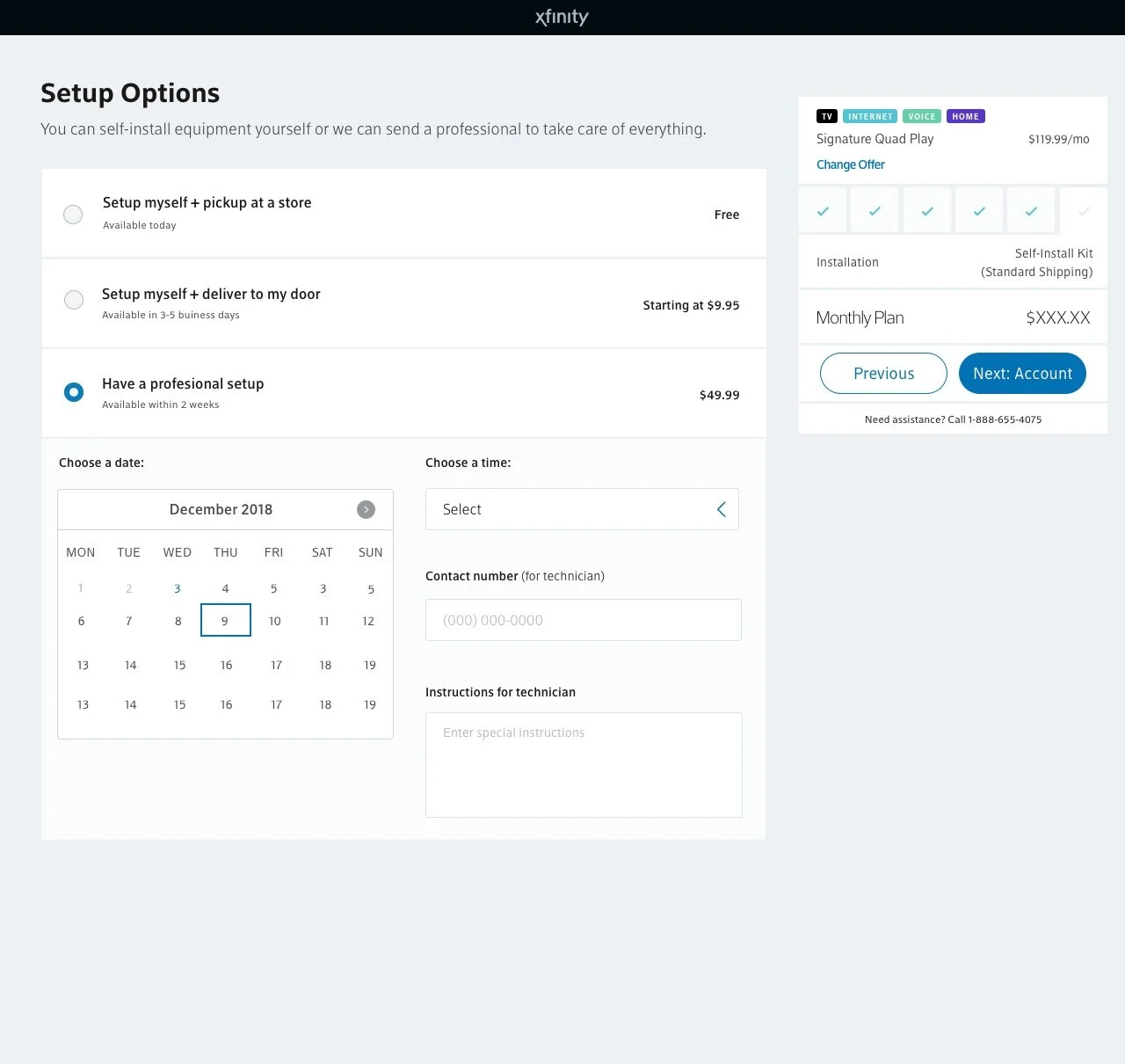
After reiterating a few rounds on the wireframes and collaborating with dev to get their input early, we all collectively chose to combine a few ideas. We decided that pick up in-store belonged as a shipping option, narrowing down three top-level options to just two which would ease users’ cognitive load on page load. We were then tasked with exploring different ways to show a calendar picker while also keeping in mind current patterns and mobile-friendly first.
Examples (I’ve selected a few, there were many more):


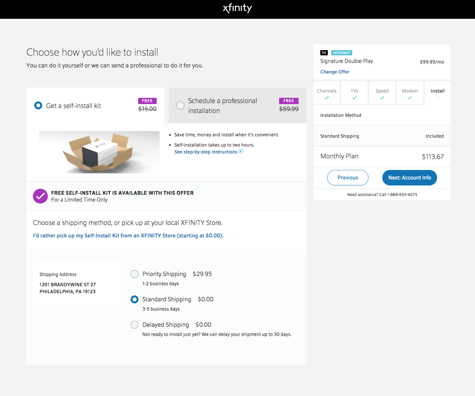
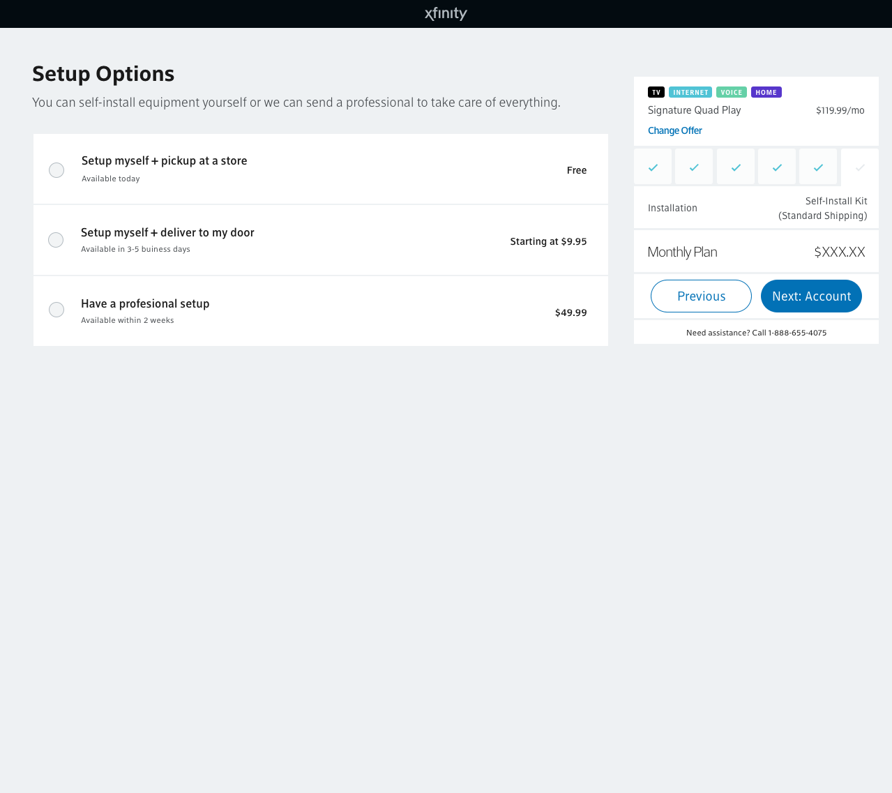
Final Mockups for Mobile & Desktop
Click here to go to InVision
Illustration Research:
Our UX research team conducted qualitative unmoderated (video recorded) user interviews to get feedback about three scenarios in randomized order on desktop. Scenario A had illustrations, Scenario B had photos, Scenario C had no images. Results were strongly positive for Scenario A (illustrations).
Users valued the imagery because it gave context to the options provided on the screen, made the experience more engaging, and sped up content comprehension. 67% reported that illustrations were most helpful in deciding installation method. Users reported that all versions of the page were easy to use and important information was clear. Users also appreciated in-page features like the scheduling window and google map pop-up that enabled them to complete tasks without leaving the page.
Results:
We were only able to support two installation use cases at the start, by the end of this project we can now support well over eighteen use cases for both customers and our agents. This was an excellent example of cross-team collaboration between development, UX and product. It also resolved technical debt while being scale-able for the future, which had tremendous business value. It improved our overall order conversion, +205 bps and +156 bps in new and existing customers respectively. Additionally self-install kit take rate improved by +46 bps. Mobile saw a more significant increase relative to desktop increase, which we can assume was because of the adaptive layout specifically designed for mobile.
Korbyt
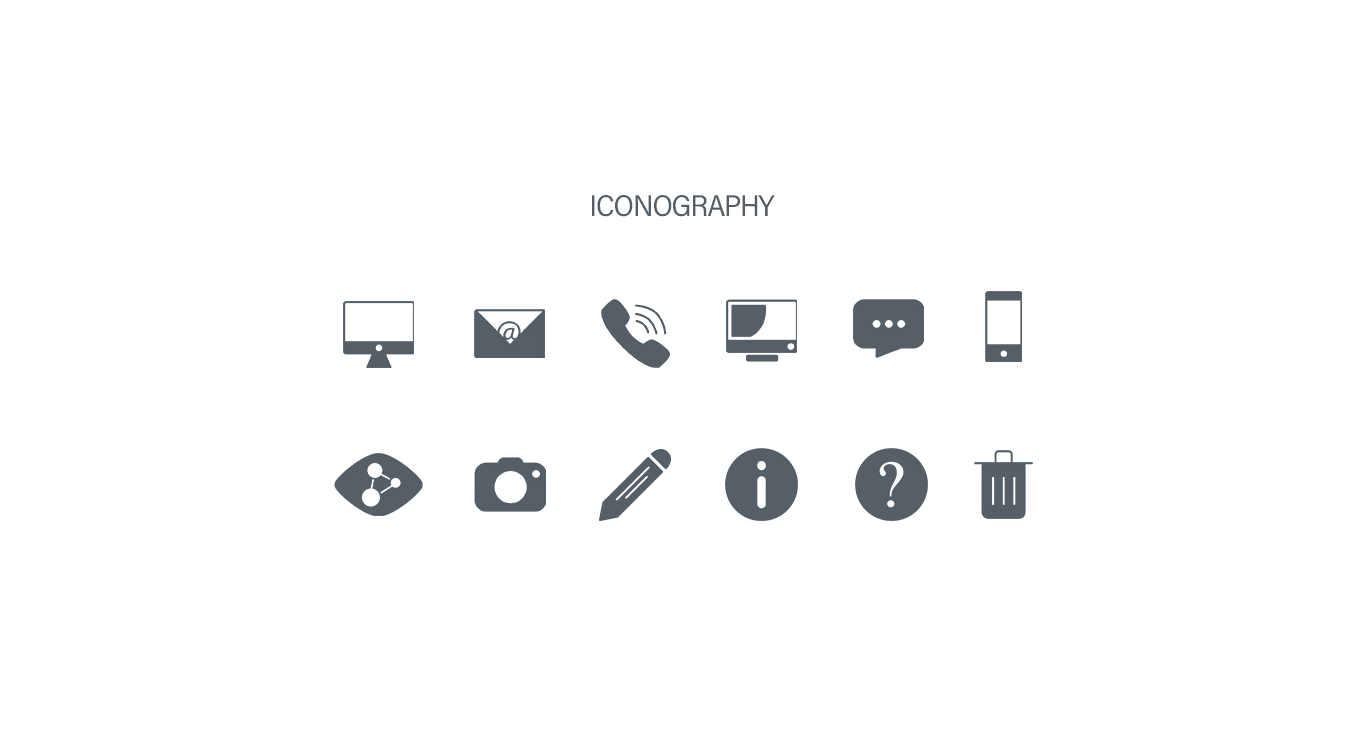
Iconography
I designed the Korbyt software icons to have their own look and feel—friendly and approachable. To achieve this feel, most edges of the icons are rounded and soft, and the outlined look is predominantly used, which makes them feel light and airy. I also created multiple versions of each icon—solid, outline, solid circle, outline circle and solid color in order to have the appropriate visibility and user experience as it related to hovering buttons, applying certain settings and also disabled buttons. Final format is svg.
Like Button
The "like" button I designed to be used in the KorbytGO application after a user likes a post in the news feed. Fun and flair was the goal!
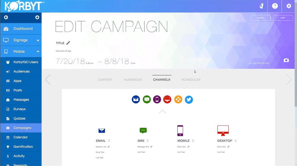
Case Study: Korbyt Software—Campaign Experience and New Features
Below is a screenshot of the Korbyt campaign page prior to my UX/UI redesign.
As you can see above, there are options everywhere and it's confusing to know what to do first, what is required for proper functionality and what is optional. The goal was to give the user plenty of freedom, however, not so much freedom that it creates chaos or confusion about what to do.
Research
No user research was available for me to review at the time of redesign. Since I was a new user to the software, I took extensive notes on problems I had with this experience and also ideas on how to improve them. I also asked a few colleagues what their experiences and frustrations were about the campaigns page. Gathering the information that I could, while also researching competitive software experiences I was able to make a revised list of experience revisions and UI enhancements that would give Korbyt the edge in the industry.
Wireframe
I used InVision to build out the wireframe of the revised experience seen below. This is the final wireframe after meetings, input from colleagues, requirements and ideas that were expanded upon.
Prototype and Mockup
I used Adobe XD to build out the wireframe from just a concept to something more substantial, a prototype, for our developers. Ideally I would not want to combine the prototype and mockup together, however I was only given a couple days to complete both, so I created the prototype and mockup as one in the same. Normally a prototype would show the wireframe in a usable way, while the mockup is reserved for UI design and details such as typefaces, coloring, hovering effects and other interactivity such as animation bézier curves. Below are short animated gif examples of the finalized experience.
Campaign Requirements
In the old experience, adding a new campaign required a title and start and end date. These settings could be found in the "metadata" (even though metadata is for information such as tags) section and not easily available to be seen and edited. In the new experience, the title, description, tags, and date settings are readily available to be seen and edited. Clicking "save" without setting any of the required elements will cause the sections to be highlighted, indicating to the user to fill them out (not seen in the gif, was completed in development).
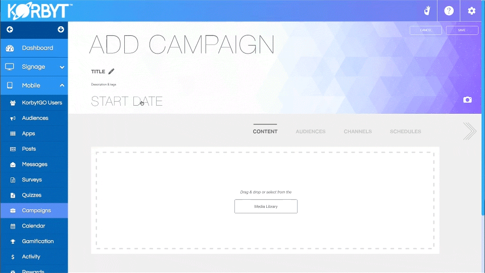
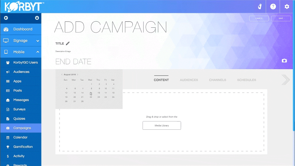
Campaign Content and Media Library
In the new experience, the user can add new content, assign an audience, assign channels or schedule the content in any order they wish, but to make things easier to digest and understand, the navigation is set to show the suggested flow and order that the user would naturally take. First, assigning content they already have in mind for their campaign.
Assigning Campaign Audiences
Next, the user can choose the audience they have in mind for the content. They can either apply recently used and most used audiences from the draggable filter row or search by multiple metadata tags. Multi-select also makes it easy to quickly add audiences. The user is also given an indication of the total number of people that will be reached from all audiences combined with a smooth number counter transitional animation (not seen in gif, completed in development). Deleting audiences is a similar experience to adding audiences.
Choosing Channels to Deploy Content
Choosing channels would be the next likely step for a user to take. With an easy multi-select drag and drop feature (not seen in gif, completed in development), users can intuitively choose their channels, delete channels and apply their text and settings all at once.
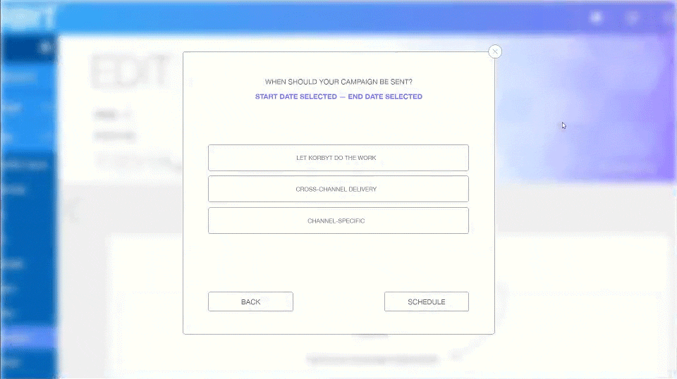
Scheduling when Content Deploys
Content on the selected channels will deploy to the audiences on a schedule that either Korbyt learns through machine learning, or the user can customize their own schedule. The scheduler also has drag and drop functionality on the calendar. Colored dots indicate what channel is scheduled on what days with both monthly and weekly views available. The dots are flexible, able to be dragged and dropped anywhere on the calendar in both monthly and weekly views (not seen in gif, completed in development).
Final Thoughts
The updates for the campaign and audience user experiences for Korbyt went live on Friday, September 7, 2018. Users found the new experience to be flexible, easy-to-use and an immense improvement over the previous experience.